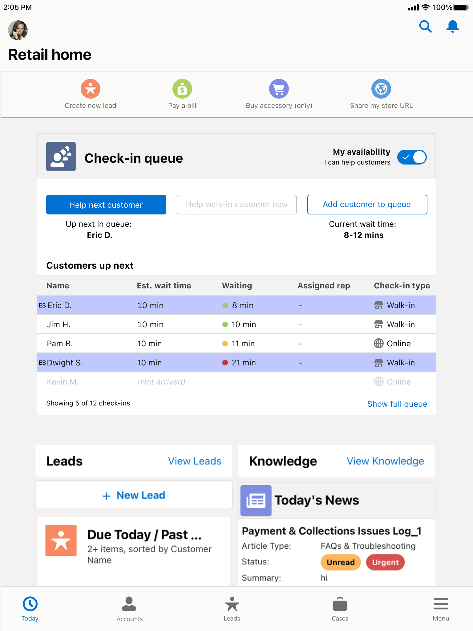
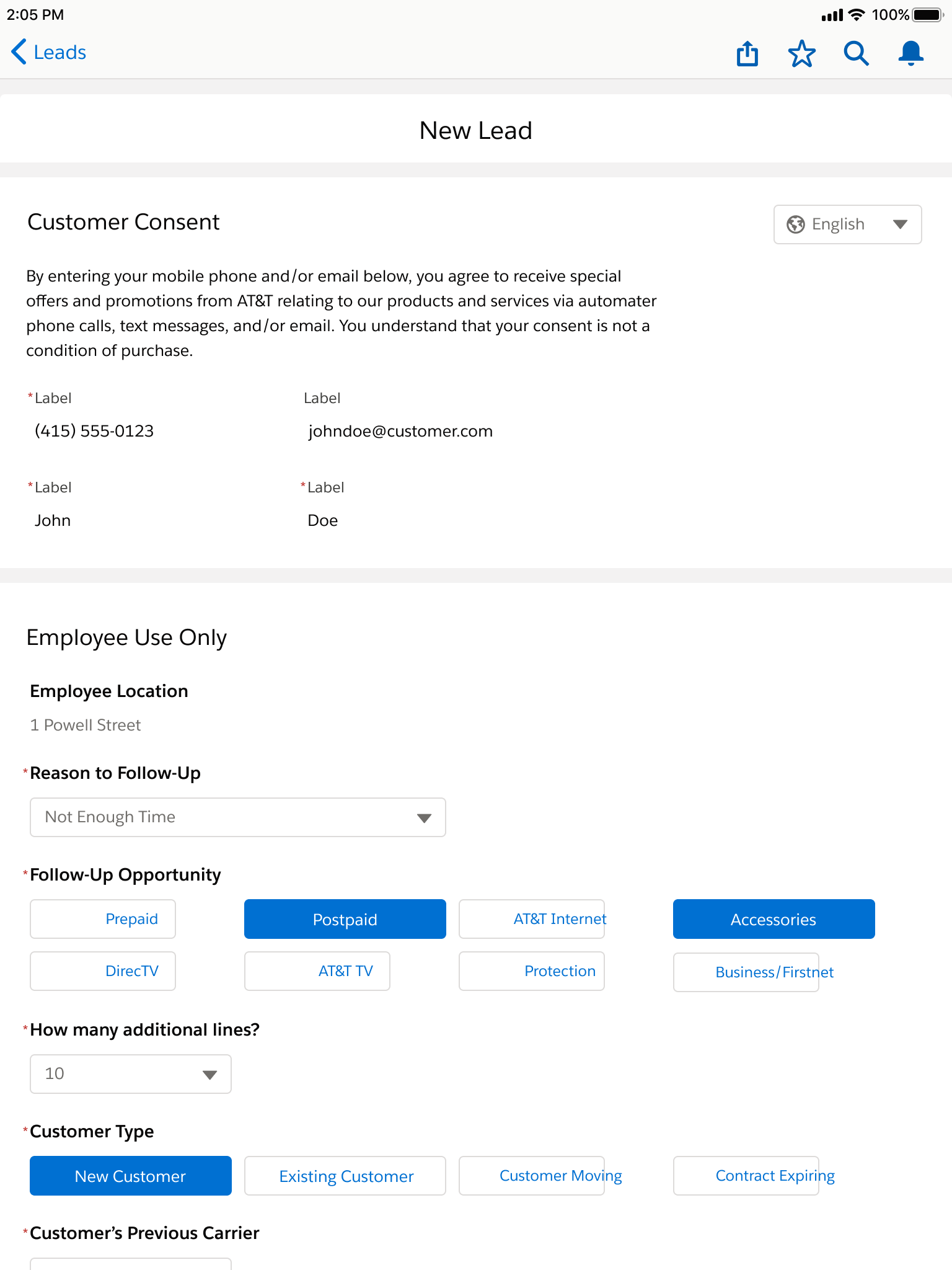
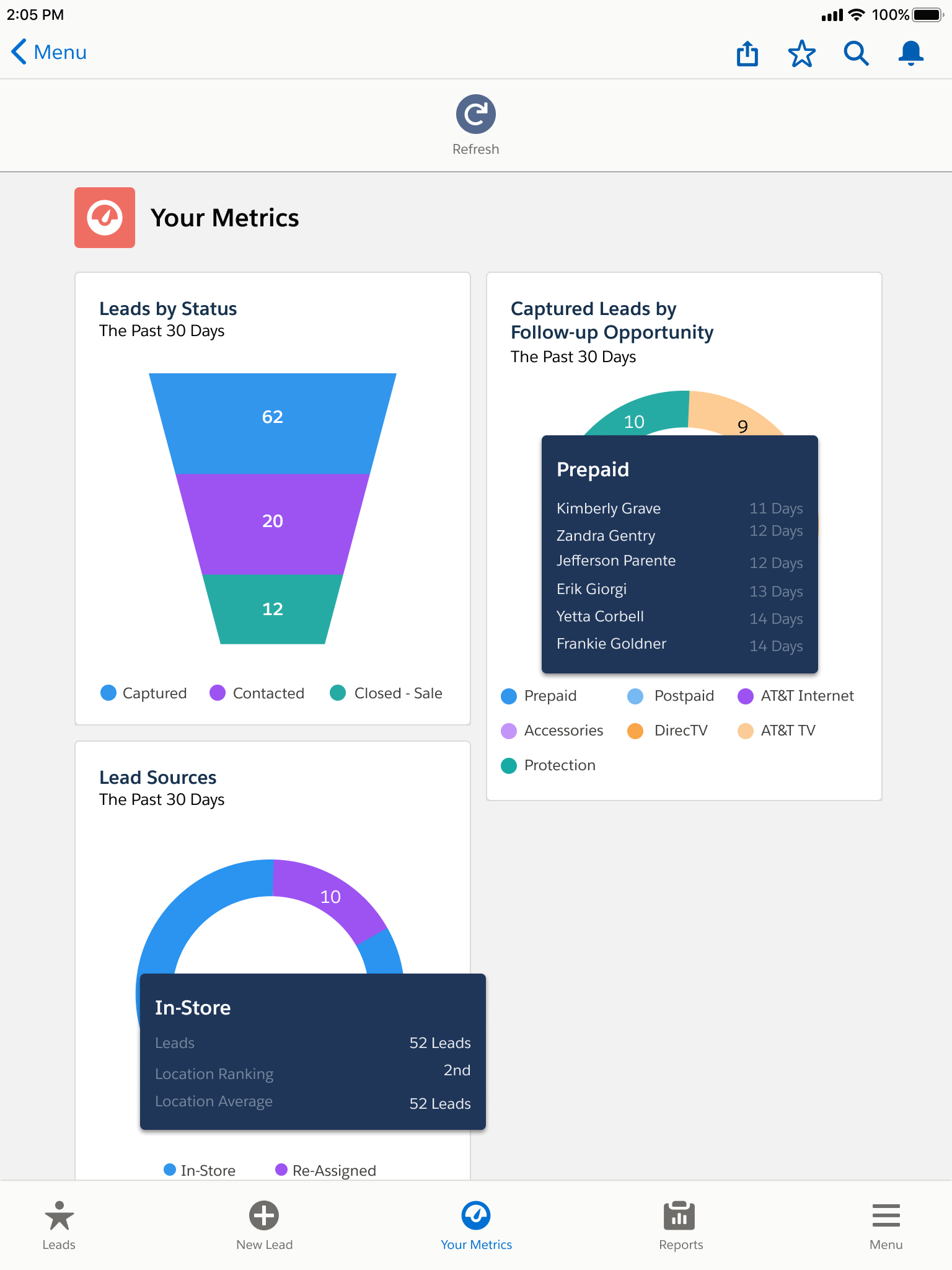
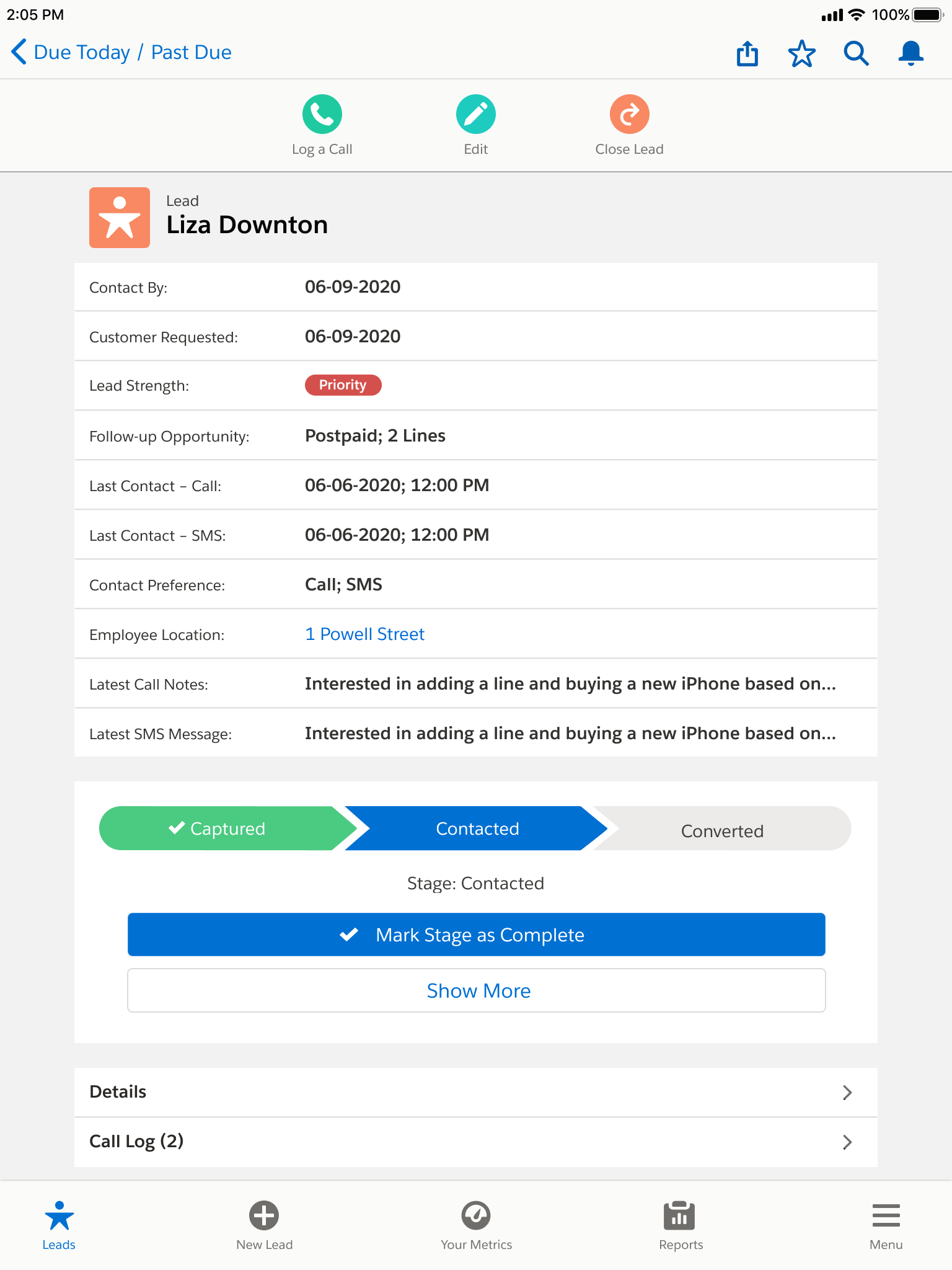
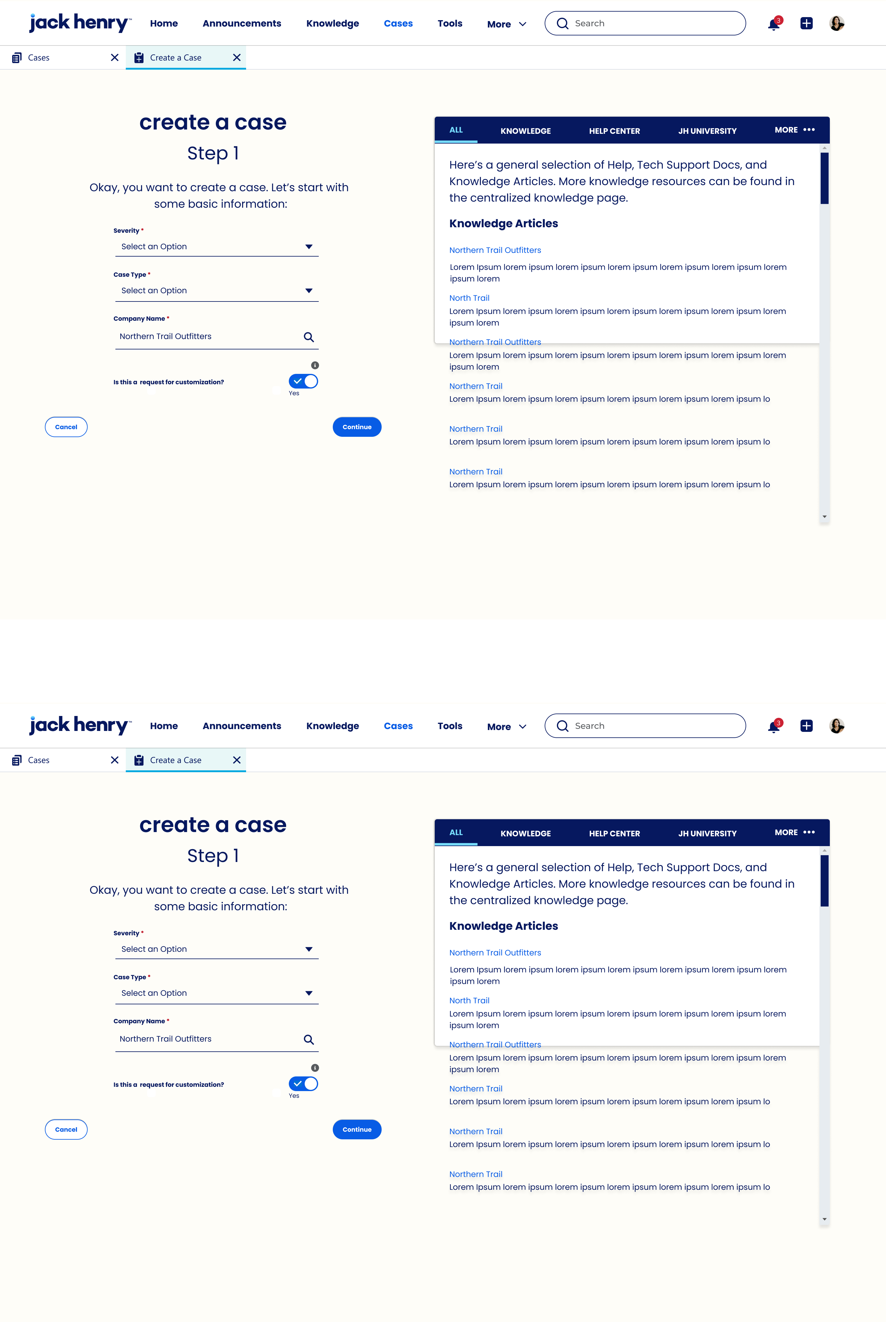
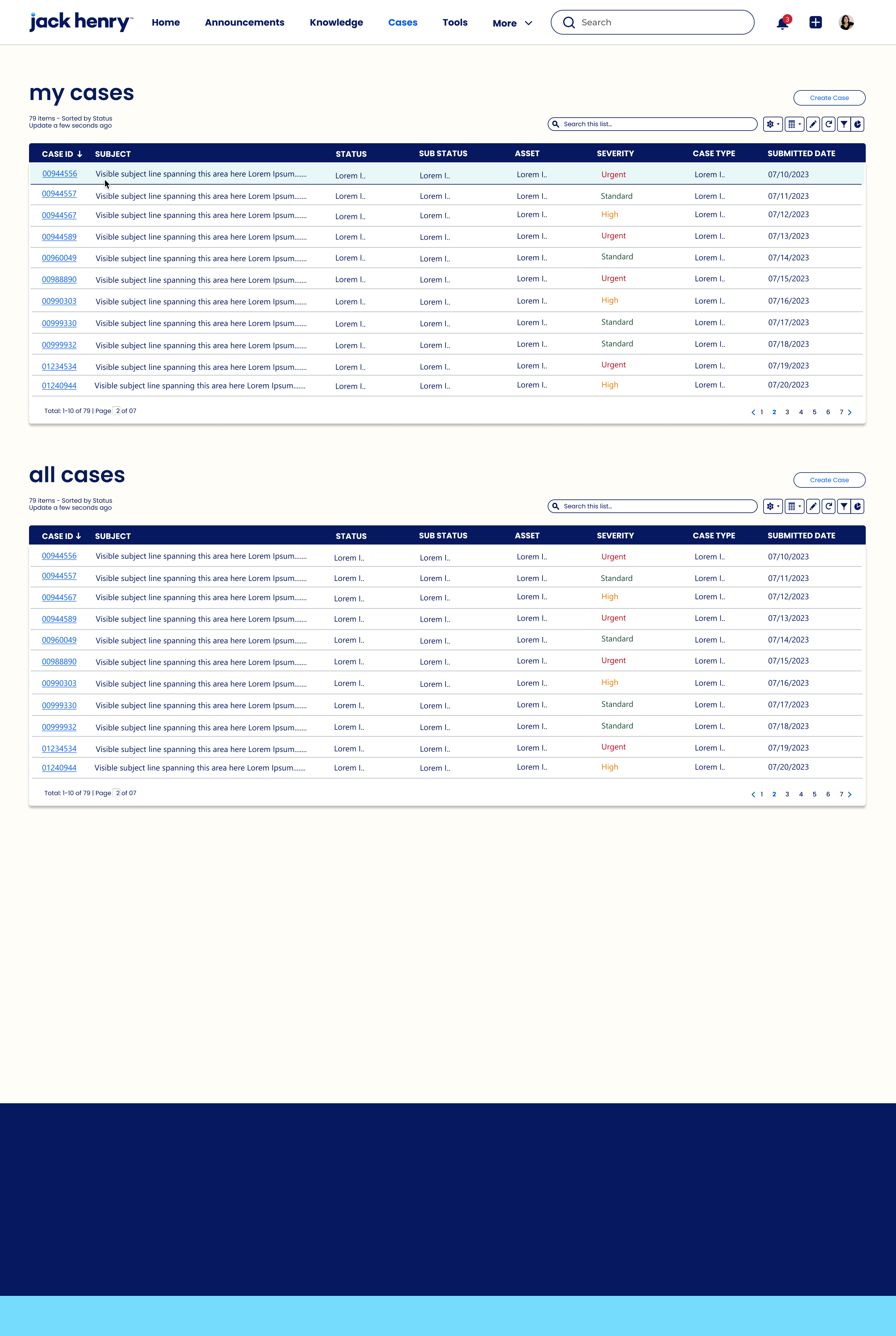
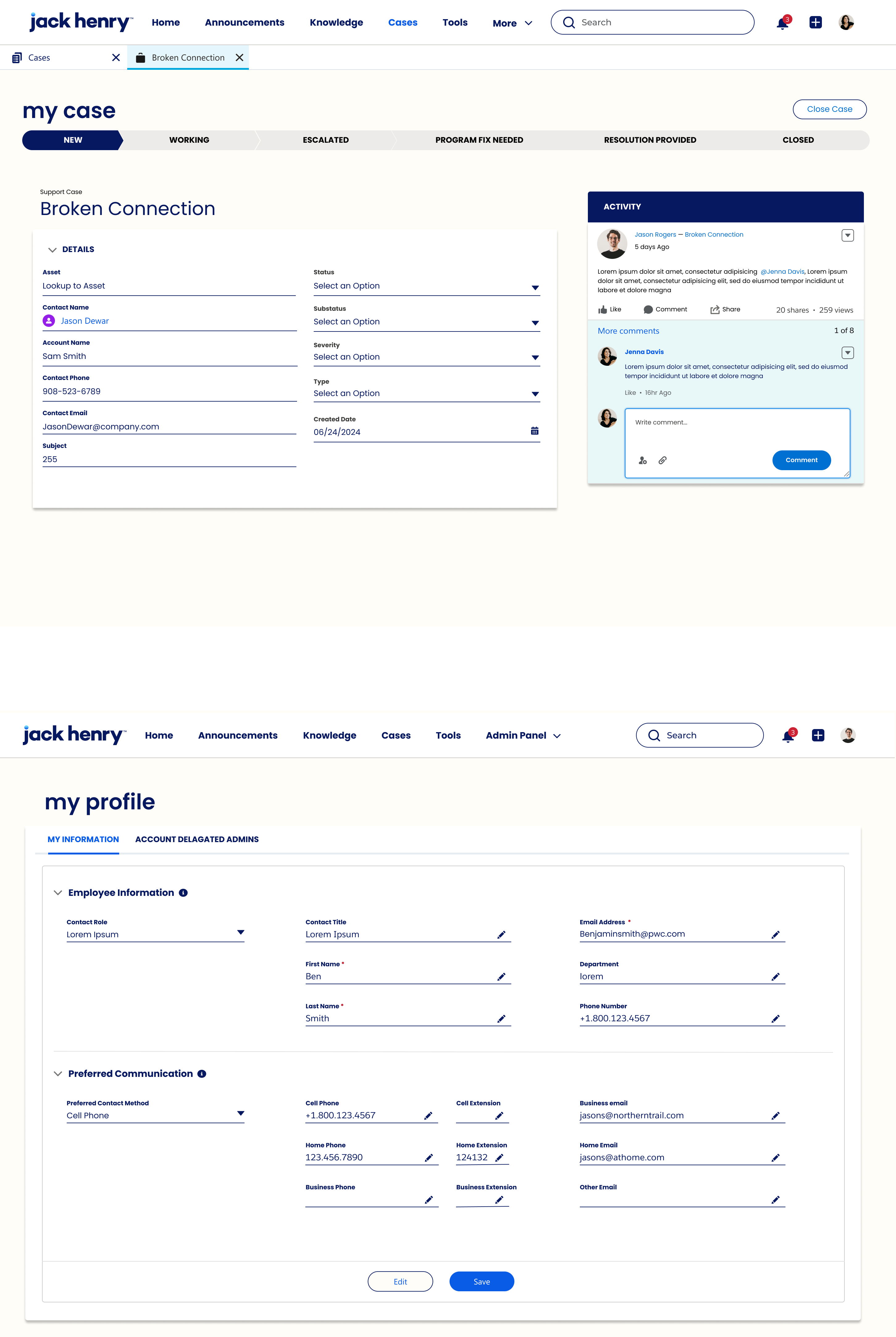
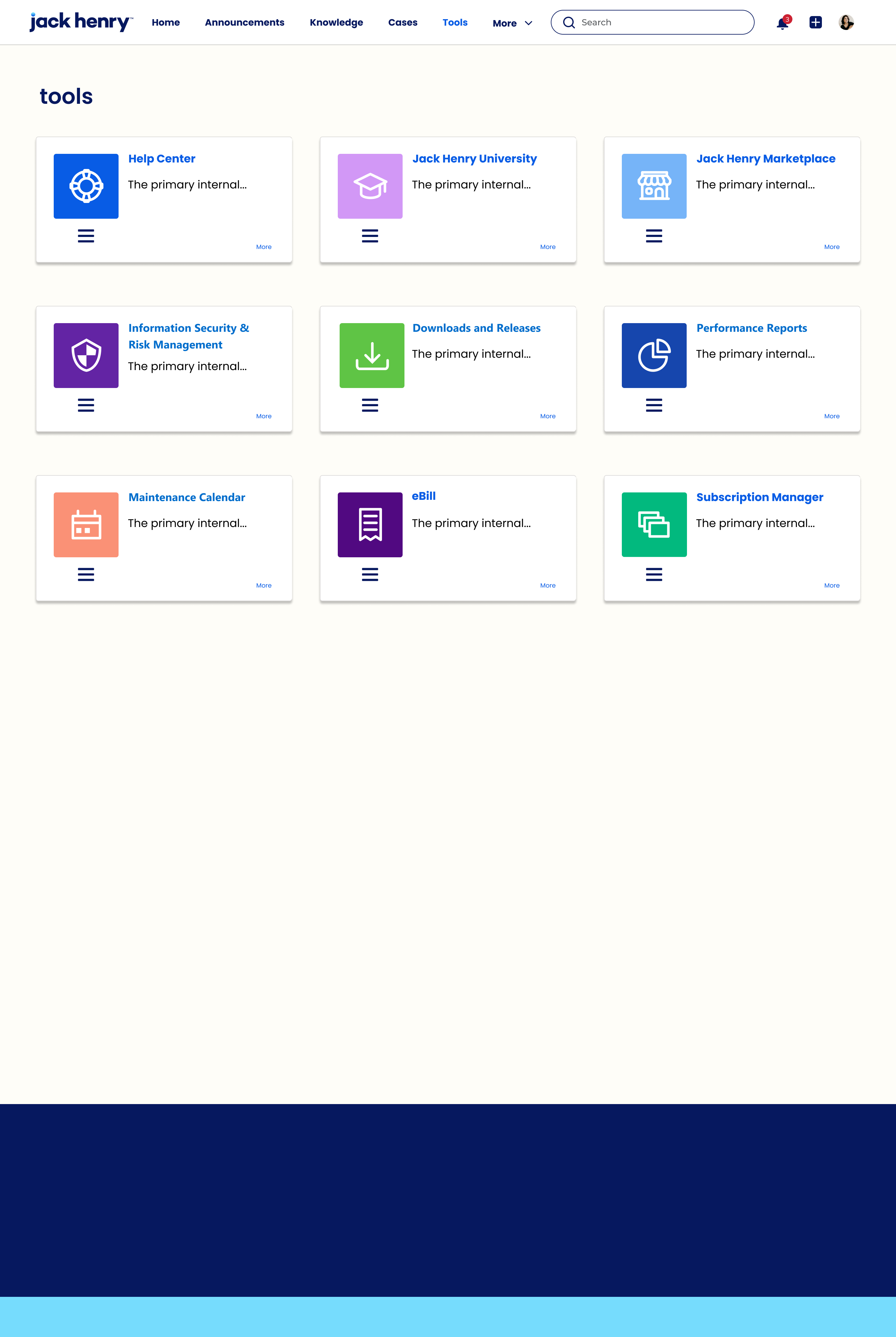
Jissan HuqProduct Designer.
Systems Architect.

Grounded Research, Intelligent IA, Design Systems at Scale,
Functional Prototyping, Strategic Design Leadership.

Product & Platform Experience | Los Angeles Scroll to Explore ↓
01 AT&T · Telecoms · Salesforce Mobile + Console
Overview

Retail Case Study · Salesforce Mobile + Console

AT&T Retail
Experience:
Leads, Sales,
Members

Modernizing lead capture and customer central across 800+ retail locations, a unified Salesforce mobile + desktop toolset for front line sales reps and support advisors.

141K
Total Employees
100M
Total Clients
395B
Total Assets
12+
Disparate Systems
Source: investors.att.com
Challenge

"Provide sales and account advisors simplified, tangible and virtual digital tools to acquire leads and offer product packages for existing B2B and B2C."

Hypothesis

A modernized sales and support toolset that intuitively flows back and forth between digital and first hand experiences will allow for greater lead generation, conversions and retention.

AT&T Retail, system architecture

IA:
Leads Mobile
MVP

Fragmented systems, no unified identity, no cross location data. The goal: a single source of truth across the entire AT&T ecosystem.

User Roles

SF AdminRSC Rep Store ManagerArea Manager DirectorAccount Exec
Lead (MVP)
Org SetupBack OfficeSF System Admin Manager ViewOnboarding Lead CaptureLead Distribution Sales QualificationSales Process
Role HierarchyAdd Rep, CinglePointDeactivate Rep All Leads, Store (ATTR)SSO Auth to SF Auto Lead Creation, OPUSLeads to Contact Today Leads Closed Per RepLong Term Leads Mgmt
ProfileAdd Rep, MyLoginProfile Management All Leads, Store (AR)SSO Auth to OPUS Auto Lead Creation, SFRep Engagement Lead EnrichmentLead Reconciliation
Permission SetsAdd Rep, HaloSecurity / Encryption Auto Onboard on Store Change Prepopulate Customer InfoAuto Transfer Reps Notifications SummaryAuto Sales Reconcile
SharingNightly Batch, MulesoftRole Hierarchy Failed Authentication Capture Consent EN + ESRep Relationship Strength Notification Pref MgmtLead Conversion
VisibilityRep DeprovisioningSharing Rules Rep View of Leads Store Location Distancing SMS Initiation
Base Data ModelMobile App Config
Project Objective
UX Design
Key Decision
Manager View
Reporting (AR)

AT&T Retail, Salesforce Mobile

Early
Exploration

Here we have some examples from rough sketches to full fidelity wireframes. For AT&T design process started with executive presentations that showed an illustrative preview, before moving to wires that follow and interactive prototypes. Swipe through to see some of the early examples.

Here we have some examples from rough sketches to high fidelity wireframes. Swipe below to take a look.

Design
System

A living component library documenting typography, color tokens, iconography, spacing, and reusable patterns, built to maintain consistency across 800+ retail locations and multiple user roles.

Brand + context

AT&T logo
AT&T Retail
Leads + service workflow
Salesforce cloud logo
Salesforce Mobile
In store leads & care

Typography + spacing

  • Headline 1--type-page-headline · 22px · 700
  • Hero--type-hero · 24px · 700
  • Module title--component-primary-title-size · 16px
  • Body / Queue row--type-body 13px / --type-queue-row 12.5px
  • Meta / Caption--type-meta 11px / --type-caption 9px

Spacing scale

4
8
12
14 (page)
16
24

Stack gap token: --att-card-stack-gap = 12px

Color tokens

Square chips: fill = token; label + value below (prototype palette).

#00A8E0
#0C2577
rgb(242,250,253)
#6EBB1F
#FFB000
#FF585D

Buttons

Tabs

SLDS like active rail using AT&T brand blue.

Forms

Error state mirrors red indicator palette from prototype.

Module + Notification

My Leads · Today
Jordan LeeFollow up
Wireless upgrade9:42 AM
Store 0142Open
AT&T Leads2 leads need follow up today. Tap to sign in and review your queue.

Lock screen notification + module header/body pattern.

System Goal

Unify lead capture, follow up, and service visibility across AT&T retail workflows.

Process

1. Discovery + role mapping
2. Flow architecture + SSO gating
3. Tokenized UI foundations
4. Open state component patterns
5. Prototype validation + handoff

User Roles

Store Manager Area Manager Sales Rep System Admin

Execution Matrix

Org SetupOnboardingLead CaptureLead DistributionSales Process
Role hierarchy + permissionsSSO auth to SFAuto lead creationQueue by account ownerLong term lead mgmt
Visibility + sharing rulesField validationOpportunity signalsStore location balancingRoute unresolved
Data model alignmentMy view of leadsCapture context on siteNotification summaryKPI + SLA actions
UX design System config Manager/reporting

Screen map (labels)

00 · App Launch / Lock 01 · SSO Login 02 · Front Line Hub 03 · Leads Queue 04 · Lead Detail 05 · Lead Creation 06 · Accounts 07 · Cases 08 · Area Metrics 09 · Knowledge Panel 10 · Menu & Settings 11 · Notifications

Inline att-defs sprite in body SVG (97 <symbol> ids). Below: 94 ic-* previews; att-globe, att-wordmark, and att-mark are composite marks.

ic-back
ic-share
ic-star
ic-star-fill
ic-search
ic-bell
ic-menu
ic-x
ic-trash
ic-edit-rail
ic-trash-rail
ic-chev-right
ic-chev-down
ic-check
ic-queue-add
ic-megaphone
ic-leads
ic-metrics
ic-reports
ic-app-launcher
ic-allitems
ic-knowledge
ic-link
ic-handoff
ic-prospect
ic-lead-icon
ic-call
ic-call-outline
ic-sms
ic-sms-rail
ic-email
ic-note
ic-event
ic-edit
ic-clone
ic-close-lead
ic-lead-close
ic-att-bell
ic-sort
ic-col-sort
ic-filter
ic-money
ic-refresh
ic-cloud
ic-spark
ic-escalate
ic-device
ic-tools
ic-issues
ic-newcust
ic-complete
ic-phone
ic-headphones
ic-signal
ic-sb-cellular
ic-sb-wifi
ic-sb-battery
ic-info
ic-dots-v
ic-cal
ic-globe
ic-gift
ic-tag
ic-trophy
ic-clock-warn
ic-article
ic-bookmark
ic-sparkle
ic-lightbulb
ic-rocket
ic-check-fill
ic-grip
ic-list
ic-grid
ic-today
ic-account
ic-cases
ic-cart
ic-watch
ic-money-bag
ic-store
ic-location
ic-today-module-checkin
ic-today-module-leads
ic-today-module-favorites
ic-today-module-knowledge
ic-news
ic-checkin
ic-walking
ic-cog
ic-signout
ic-question
ic-toggle-on
ic-toggle-off

AT&T Retail, Salesforce Mobile

Retail Management

This clickable prototype is a peek into the retail application for AT&T built on Salesforce. It’s meant to show both design and architecture in key touchpoints. Click below or in the example itself.

800+
Retail Locations
↑34%
Lead Conversion
6 Roles
SF Admin, RSC Rep, Store Manager, Area Manager, Director, Account Exec

AT&T Retail, Salesforce Mobile

Impact &
Outcomes

Pilot metrics after IA, design system, and prototype alignment: faster lead progression, fewer one-off builds in the field, and measurable lift where store and area teams adopted the shared Salesforce patterns.

Projected savings

FY2022 • FY 2023

$94Mprogram curve at FY2023 Q2 (illustrative)

Without program realignment With IA, design system, and experience-led delivery

Illustrative curve: baseline assumes incremental fixes only; program line assumes milestones for IA lock, component adoption, and pilot hardening.

Completion times

−38%

median completion time for priority leads versus fragmented paths

Form completion speed (indexed)

Leads scattered across tools; many never finished. One guided path sped completion and tightened capture.

Adoption stats

12K+

AT&T employees from pilot through launch on shared surfaces

Role reach (indexed)

Retail first, then partners and care. Shared IA kept training light while coverage widened.

Conversion rates

+31%

stronger close rates after one unified customer journey

Lead-to-customer (indexed)

Handoffs from first touch to close unified; fewer drop-offs once the journey read as one program.

02 Jack Henry · Financial Services · Experience Cloud Portal
Overview

Tech Case Study · Financial Services Portal

Jack Henry
Financial
Services

A unified Salesforce Experience Cloud portal consolidating onboarding, knowledge, support and governance for 8,500 community banks and credit unions.

Total Employees
Total Clients
Total Assets
Disparate Systems
Source: jackhenry.com

IA:
Experience
Cloud Portal

8 disconnected systems, separate logins per tool, no shared record. The goal: one Experience Cloud portal with a unified identity layer.

User Roles

Bank AdminSupport Agent Training LeadDelegated Admin IT Ops
Case ManagementKnowledge Ecosystem Account & IdentityAsset & Vendor Mgmt Tools MarketplaceAnnouncements Notifications
Create Case WorkflowKnowledge Articles My ProfileVendor Accounts DownloadsHomepage AlertsCase Update Emails
Case List / TableProduct Documentation Contact RolesSupported Assets Performance ReportsProduct AnnouncementsStatus Notifications
Case DetailRelease Updates Delegated AdminsAsset Authorization Security ToolsOutage NotificationsSystem Alerts
Activity TimelineTraining Resources Access PermissionsAccount Mapping Maintenance CalendarEvent NotificationsUser Messaging
Case NotificationsSuggested Knowledge ✦ AI User Contact InfoAsset Permissions Subscription Mgr
Case Severity eBill
Portal Root
Core Capability
UX Design Focus
Key Decision
AI enabled

Jack Henry Customer Success, Experience Cloud

Early
Exploration

Early collaboration with stakeholders shaped the direction from the ground up. These screens trace the journey from initial concepts and rough layouts, through iterative refinements with product and engineering, to the final designs delivered for development. Swipe through to follow the progression.

From early concepts to final delivery, here's how it came together. Swipe through to follow the progression.

Design
System

A comprehensive component library documenting typography, color tokens, iconography, spacing, and interactive patterns, built to maintain consistency across the agentic portal's operational workflows and user roles.

Logos + context

Wordmark from Jack Henry brand. System uses all 244 SVG assets from the Jack Henry Assets folder (Shape, Stroke variants, and Vector sequence).

Typography + spacing

  • App bodysystem-ui · 14px · 1.5 · --navy
  • Primary nav link.nl · 14px · 500/600 active · cobalt rail
  • Section tabs.segtab · 11px · 700 · uppercase · letter-spacing .08em
  • Buttons.btn · 13px · 600 · border-radius pill
  • Insight / meta.insight · 11px · insight or purple variant

Spacing (common rhythm)

4
8
12
16
20
24
32

Radii: 20px for pills/buttons; 8px for cards, nudges, and agent chrome.

Color tokens

Square chips: fill = token; label + value below.

#06185F
#085CE5
#76DCFD
#E8F7F7
#FEFDF8
#575A5D
#64952C
#DD7A01
#D0021B
#7C3AED
insight surfaces
--agent-tint / --agent-border

Buttons

Tabs

Overview Activity Files

Browser style row for multi doc context.

Search + fields

Search knowledge…

Focus ring mirrors cobalt; errors use --urgent.

Insights + agent

Scheduled maintenance · Banno
Suggested playbook · MFA rollout
Ask Care Team Summarize case Draft follow up
Agent nudge. Three cases share the same Symitar error code, bundle a reply template?
Today · Care TeamLive
ECW style strip: sky header, white body, bordered module, mirrors home hierarchy in the prototype.

System goal

Give financial institution staff one Jack Henry branded hub for operational content, cases, and tools, with agent assisted summaries and admin guardrails.

Delivery arc

1. Token audit (navy / cobalt / bile + grays)
2. Nav + IA alignment (Home → Account Access)
3. Agent rail + nudge patterns
4. Knowledge + cases templates
5. Admin panel depth + SSO states

Roles

Community user CS / Care Compliance Security admin

Execution matrix

FoundationsNavigationKnowledgeCases + toolsAgent + admin
Color, type, radii, shadowsPrimary nav + search pillArticles, ratings, filtersQueues, timelines, attachmentsAgent rail, nudges, approvals
jh icons only (named SVGs)Section tabs + browser tabsCategory IA + empty statesTool deep links + modalsAdmin hierarchy + MFA copy
Insight chips (standard / purple)Notifications + badgesCompliance calloutsCommand / ECW widgetsAudit trails + reporting
UX / content System / eng Policy / admin

Screen map (labels)

00 · Global nav + search 01 · Home + action banner 02 · Announcements 03 · Knowledge base 04 · Cases hub 05 · Tools directory 06 · Admin panel 07 · Account access 08 · Agent rail (Care Team) 09 · Notifications 10 · Command / ECW strip

Every .svg in Jack Henry Assets (244 files): Shape.svg, Stroke variants, then Vector.svg through Vector 234.svg. Navy applied via CSS filter; files stay unchanged.

Shape.svgShape.svg
Stroke 206.svgStroke 206
Stroke 207.svgStroke 207
Stroke 210.svgStroke 210
Stroke 211.svgStroke 211
Stroke 214.svgStroke 214
Stroke 338.svgStroke 338
Stroke 340.svgStroke 340
Stroke 343.svgStroke 343
Vector.svgVector
Vector-1.svgVector-1
Vector-2.svgVector-2
Vector-3.svgVector-3
Vector-4.svgVector-4
Vector-5.svgVector-5
Vector-6.svgVector-6
Vector-7.svgVector-7
Vector-8.svgVector-8
Vector-9.svgVector-9
Vector-10.svgVector-10
Vector-11.svgVector-11
Vector-12.svgVector-12
Vector-13.svgVector-13
Vector-14.svgVector-14
Vector-15.svgVector-15
Vector-16.svgVector-16
Vector-17.svgVector-17
Vector-18.svgVector-18
Vector-19.svgVector-19
Vector-20.svgVector-20
Vector-21.svgVector-21
Vector-22.svgVector-22
Vector-23.svgVector-23
Vector-24.svgVector-24
Vector-25.svgVector-25
Vector-26.svgVector-26
Vector-27.svgVector-27
Vector-28.svgVector-28
Vector-29.svgVector-29
Vector-30.svgVector-30
Vector-31.svgVector-31
Vector-32.svgVector-32
Vector-33.svgVector-33
Vector-34.svgVector-34
Vector-35.svgVector-35
Vector-36.svgVector-36
Vector-37.svgVector-37
Vector-38.svgVector-38
Vector-39.svgVector-39
Vector-40.svgVector-40
Vector-41.svgVector-41
Vector-42.svgVector-42
Vector-43.svgVector-43
Vector-44.svgVector-44
Vector-45.svgVector-45
Vector-46.svgVector-46
Vector-47.svgVector-47
Vector-48.svgVector-48
Vector-49.svgVector-49
Vector-50.svgVector-50
Vector-51.svgVector-51
Vector-52.svgVector-52
Vector-53.svgVector-53
Vector-54.svgVector-54
Vector-55.svgVector-55
Vector-56.svgVector-56
Vector-57.svgVector-57
Vector-58.svgVector-58
Vector-59.svgVector-59
Vector-60.svgVector-60
Vector-61.svgVector-61
Vector-62.svgVector-62
Vector-63.svgVector-63
Vector-64.svgVector-64
Vector-65.svgVector-65
Vector-66.svgVector-66
Vector-67.svgVector-67
Vector-68.svgVector-68
Vector-69.svgVector-69
Vector-70.svgVector-70
Vector-71.svgVector-71
Vector-72.svgVector-72
Vector-73.svgVector-73
Vector-74.svgVector-74
Vector-75.svgVector-75
Vector-76.svgVector-76
Vector-77.svgVector-77
Vector-78.svgVector-78
Vector-79.svgVector-79
Vector-80.svgVector-80
Vector-81.svgVector-81
Vector-82.svgVector-82
Vector-83.svgVector-83
Vector-84.svgVector-84
Vector-85.svgVector-85
Vector-86.svgVector-86
Vector-87.svgVector-87
Vector-88.svgVector-88
Vector-89.svgVector-89
Vector-90.svgVector-90
Vector-91.svgVector-91
Vector-92.svgVector-92
Vector-93.svgVector-93
Vector-94.svgVector-94
Vector-95.svgVector-95
Vector-96.svgVector-96
Vector-97.svgVector-97
Vector-98.svgVector-98
Vector-99.svgVector-99
Vector-100.svgVector-100
Vector-101.svgVector-101
Vector-102.svgVector-102
Vector-103.svgVector-103
Vector-104.svgVector-104
Vector-105.svgVector-105
Vector-106.svgVector-106
Vector-107.svgVector-107
Vector-108.svgVector-108
Vector-109.svgVector-109
Vector-110.svgVector-110
Vector-111.svgVector-111
Vector-112.svgVector-112
Vector-113.svgVector-113
Vector-114.svgVector-114
Vector-115.svgVector-115
Vector-116.svgVector-116
Vector-117.svgVector-117
Vector-118.svgVector-118
Vector-119.svgVector-119
Vector-120.svgVector-120
Vector-121.svgVector-121
Vector-122.svgVector-122
Vector-123.svgVector-123
Vector-124.svgVector-124
Vector-125.svgVector-125
Vector-126.svgVector-126
Vector-127.svgVector-127
Vector-128.svgVector-128
Vector-129.svgVector-129
Vector-130.svgVector-130
Vector-131.svgVector-131
Vector-132.svgVector-132
Vector-133.svgVector-133
Vector-134.svgVector-134
Vector-135.svgVector-135
Vector-136.svgVector-136
Vector-137.svgVector-137
Vector-138.svgVector-138
Vector-139.svgVector-139
Vector-140.svgVector-140
Vector-141.svgVector-141
Vector-142.svgVector-142
Vector-143.svgVector-143
Vector-144.svgVector-144
Vector-145.svgVector-145
Vector-146.svgVector-146
Vector-147.svgVector-147
Vector-148.svgVector-148
Vector-149.svgVector-149
Vector-150.svgVector-150
Vector-151.svgVector-151
Vector-152.svgVector-152
Vector-153.svgVector-153
Vector-154.svgVector-154
Vector-155.svgVector-155
Vector-156.svgVector-156
Vector-157.svgVector-157
Vector-158.svgVector-158
Vector-159.svgVector-159
Vector-160.svgVector-160
Vector-161.svgVector-161
Vector-162.svgVector-162
Vector-163.svgVector-163
Vector-164.svgVector-164
Vector-165.svgVector-165
Vector-166.svgVector-166
Vector-167.svgVector-167
Vector-168.svgVector-168
Vector-169.svgVector-169
Vector-170.svgVector-170
Vector-171.svgVector-171
Vector-172.svgVector-172
Vector-173.svgVector-173
Vector-174.svgVector-174
Vector-175.svgVector-175
Vector-176.svgVector-176
Vector-177.svgVector-177
Vector-178.svgVector-178
Vector-179.svgVector-179
Vector-180.svgVector-180
Vector-181.svgVector-181
Vector-182.svgVector-182
Vector-183.svgVector-183
Vector-184.svgVector-184
Vector-185.svgVector-185
Vector-186.svgVector-186
Vector-187.svgVector-187
Vector-188.svgVector-188
Vector-189.svgVector-189
Vector-190.svgVector-190
Vector-191.svgVector-191
Vector-192.svgVector-192
Vector-193.svgVector-193
Vector-194.svgVector-194
Vector-195.svgVector-195
Vector-196.svgVector-196
Vector-197.svgVector-197
Vector-198.svgVector-198
Vector-199.svgVector-199
Vector-200.svgVector-200
Vector-201.svgVector-201
Vector-202.svgVector-202
Vector-203.svgVector-203
Vector-204.svgVector-204
Vector-205.svgVector-205
Vector-206.svgVector-206
Vector-207.svgVector-207
Vector-208.svgVector-208
Vector-209.svgVector-209
Vector-210.svgVector-210
Vector-211.svgVector-211
Vector-212.svgVector-212
Vector-213.svgVector-213
Vector-214.svgVector-214
Vector-215.svgVector-215
Vector-216.svgVector-216
Vector-217.svgVector-217
Vector-218.svgVector-218
Vector-219.svgVector-219
Vector-220.svgVector-220
Vector-221.svgVector-221
Vector-222.svgVector-222
Vector-223.svgVector-223
Vector-224.svgVector-224
Vector-225.svgVector-225
Vector-226.svgVector-226
Vector-227.svgVector-227
Vector-228.svgVector-228
Vector-229.svgVector-229
Vector-230.svgVector-230
Vector-231.svgVector-231
Vector-232.svgVector-232
Vector-233.svgVector-233
Vector-234.svgVector-234

Jack Henry, Experience Cloud Portal

Platform Operations

Agentic led success focused portal. A hifi prototype of the customer account experience. Click below or in the example itself.

Financial Institutions
Bank Admin, Support Agent, Training Lead, Delegated Admin, IT Ops

Jack Henry, Experience Cloud Portal

Impact &
Outcomes

Program targets for consolidation, faster paths through cases and knowledge, and governance that scales across thousands of independent institutions, grounded in the same IA and design system as the live prototype.

Projected savings

FY2024 • FY2025

$118Mprogram curve at FY2025 Q2 (illustrative)

Without portal consolidation With IA, design system, and experience-led delivery

Illustrative curve: baseline keeps fragmented tools; program line tracks consolidation, template reuse, and governance milestones.

Consolidated operational surfaces

8 → 1

primary operational hub

Operational entry points

Experience Cloud absorbed onboarding, cases, knowledge, admin; staff stopped hopping eight systems for day-one tasks.

Reduction in support tickets

−30%

knowledge surfaced inline at point of need

Ticket volume (indexed)

Inline knowledge at point of need cut repeats; agents closed common issues without escalating across tools.

Customer loyalty with education

86%

customer loyalty when education leads the journey

Loyalty with education (indexed)

Source: TSIA Customer Education Research; illustrative index versus fragmented onboarding without guided education paths.

03 Deloitte · Pro Serv · Partner Portal
Overview

Sales Case Study · Partner Portal

Deloitte
Partner
Portal

A governed Experience Cloud workspace where partner sellers run pipeline, surface relationship health, and align on opportunities, without re-keying data across CRM, email, and legacy tools.

6,905+
Partners
10+
Systems unified
54
UI marks cataloged
Salesforce Experience Cloud
Challenge

"Partners need one place to run pipeline, prove client value, and see gateway signals, without losing fidelity between insights, lists, and record detail."

Hypothesis

SSO-first access, executive-grade list chrome, and a shared IA across home, relationship insights, opportunities, and tasks will shorten cycles and keep front-office teams aligned on what matters next.

Deloitte, system architecture

IA:
Partner
Portal

Multiple CRM views, disconnected reporting, and no shared record of relationship health. The goal: one Partner Portal with a single identity layer and consistent navigation from gateway to record detail.

User Roles

Partner SellerRelationship Lead Sales OpsAlliance Manager Delegated Admin
Partner Portal
Gateway / SSOHome Relationship InsightsOpportunities AccountsContacts & Individuals My Relationship Gateway
SSO + branded gateSignature hero + KPI strip Managed / prioritized barsList + inline filters Hierarchy + portfolioContact roles + touchpoints Gateway signals + alerts
MFA + session recoveryCarousel + announcements Charts + RI widgetsPipeline board + stages Split view + related listsIndividuals workspace Cross-account nudges
Legal + regional routingQuick actions rail Subtabs + saved viewsBulk actions + pagination Account teamsLeads + conversion Escalation + handoff
Profile pickerNotifications drawer Drill to recordOpportunity detail tabs Credit + risk flagsTasks + activity timeline Reports hub
Delegated access patternsSearch + command palette Forecast rollups
Close plan + next steps
Portal root
Core workspace
UX focus
Decision / handoff

Deloitte, Partner Experience

Early
Exploration

Designing the Deloitte Partner Portal meant working closely with partners and internal stakeholders to align on workflows before a single component was built. These screens move from early fidelity layouts to the final designs handed off to engineering. Swipe through to follow the progression.

From partner workshops to final handoff, here's how the portal took shape. Swipe through to follow the progression.

Design
System

Tokens, typography, components, and data viz patterns extracted from the Partner Portal prototype, documented for consistent builds across opportunities, relationships, and reporting.

Logos + context

Deloitte wordmark

Official Deloitte vector. Green beacon with white wordmark for dark chrome and Experience Cloud headers. Light surfaces in the Partner Portal use the same geometry with black wordmark.

Typography + spacing

  • BodyOpen Sans · var(--fs-body) 1rem / var(--lh-body) 1.5 · var(--body-text)
  • Page / module titles--fs-title-lg / --fs-title · semibold where specified in chrome
  • Toolbar + table.data--fs-table 0.8125rem · --lh-table · --ctrl-h 32px controls
  • Captions + meta--fs-caption 0.75rem · --muted #53565a
  • Buttons.btn / .btn-primary / .btn-blue · 4px radius · WCAG AA contrast

Spacing (chrome rhythm)

4
8
12
16
20
24
32

Corner radius: var(--radius) 4px on buttons, fields, and cards (see 03_deloitte-partner-portal.html :root).

Color tokens

From Partner Portal :root: fill = token; label + value below.

#000000
#53565A
#D0D0CE
#BBBCBC
#FAFAFA
#86BC25
#26890D
#007CB0
#012169
#046A38
#ED8B00
#041E42

Buttons

Tabs

Overview Activity Files

Relationship Insights workspace uses compact text tabs with an accessible-green active rail (see #view-portfolio .ri-subtabs in the portal).

Search + fields

Search this list…

Controls use --line-strong borders, --radius corners, and focus via --accessible-blue (see .table-toolbar input in the portal).

Highlights + actions

Client insight refresh · FedEx
Managed services · renewal window
New opportunity Export view Share link
Assistant nudge. Two opportunities share the same account owner. Open the portfolio view to compare stage and revenue before the exec readout?
List toolbar · Relationship InsightsActive
White body, --panel chrome, and --line rules match list shells in the portal (filters, toolbar icons, pagination).

System goal

Unify Deloitte sales teams on a single Partner Portal: relationship intelligence, opportunities, tasks, and reporting with brand-correct tokens, Open Sans typography, and Salesforce-style list chrome from 03_deloitte-partner-portal.html.

Delivery arc

1. Brand PDFs + :root token pass (greens, blues, neutrals)
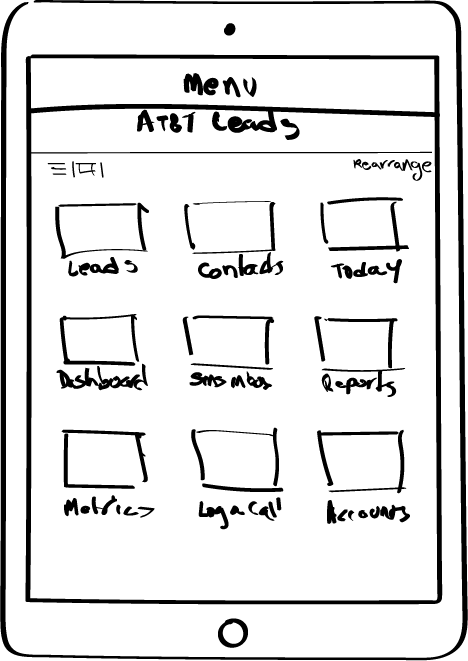
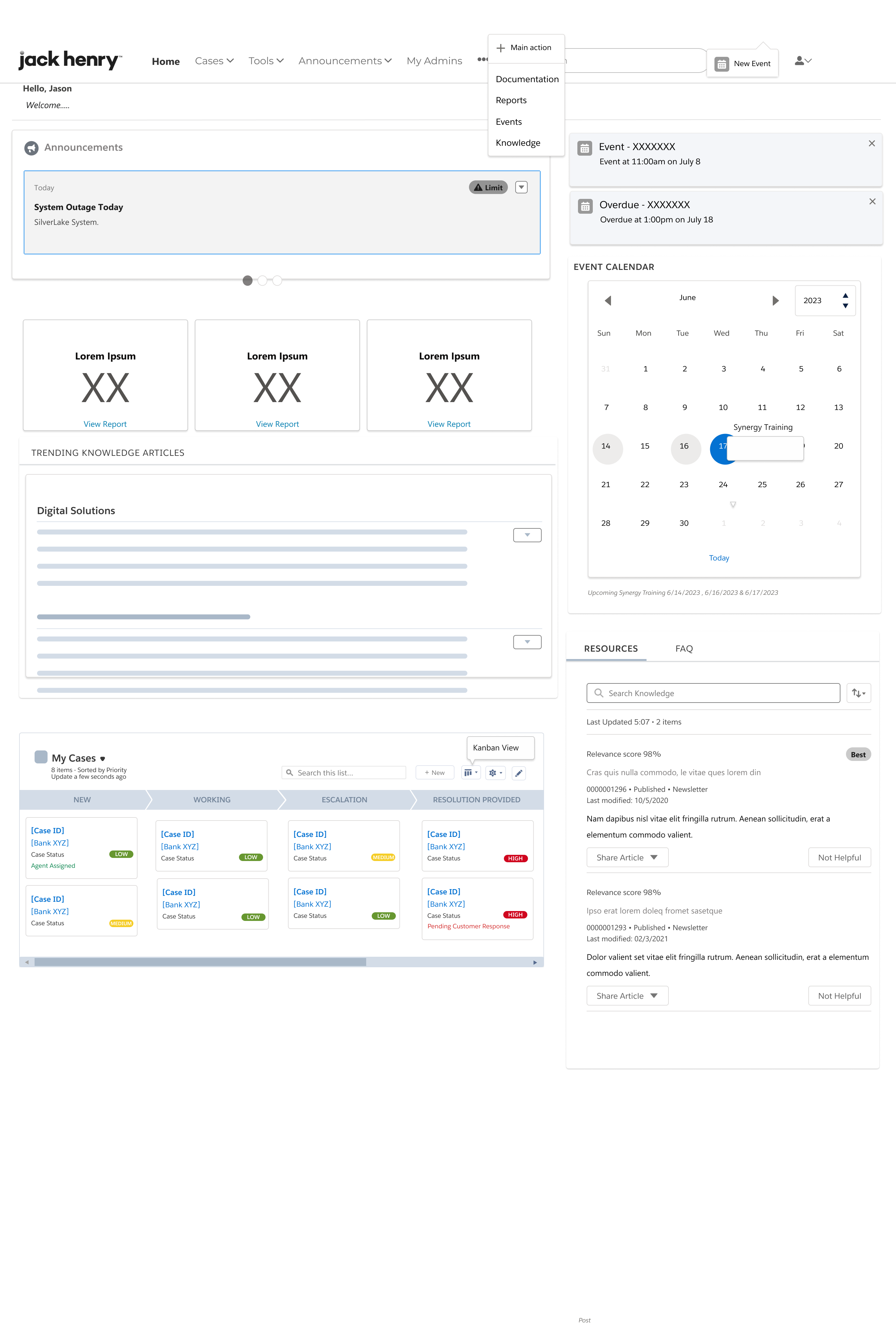
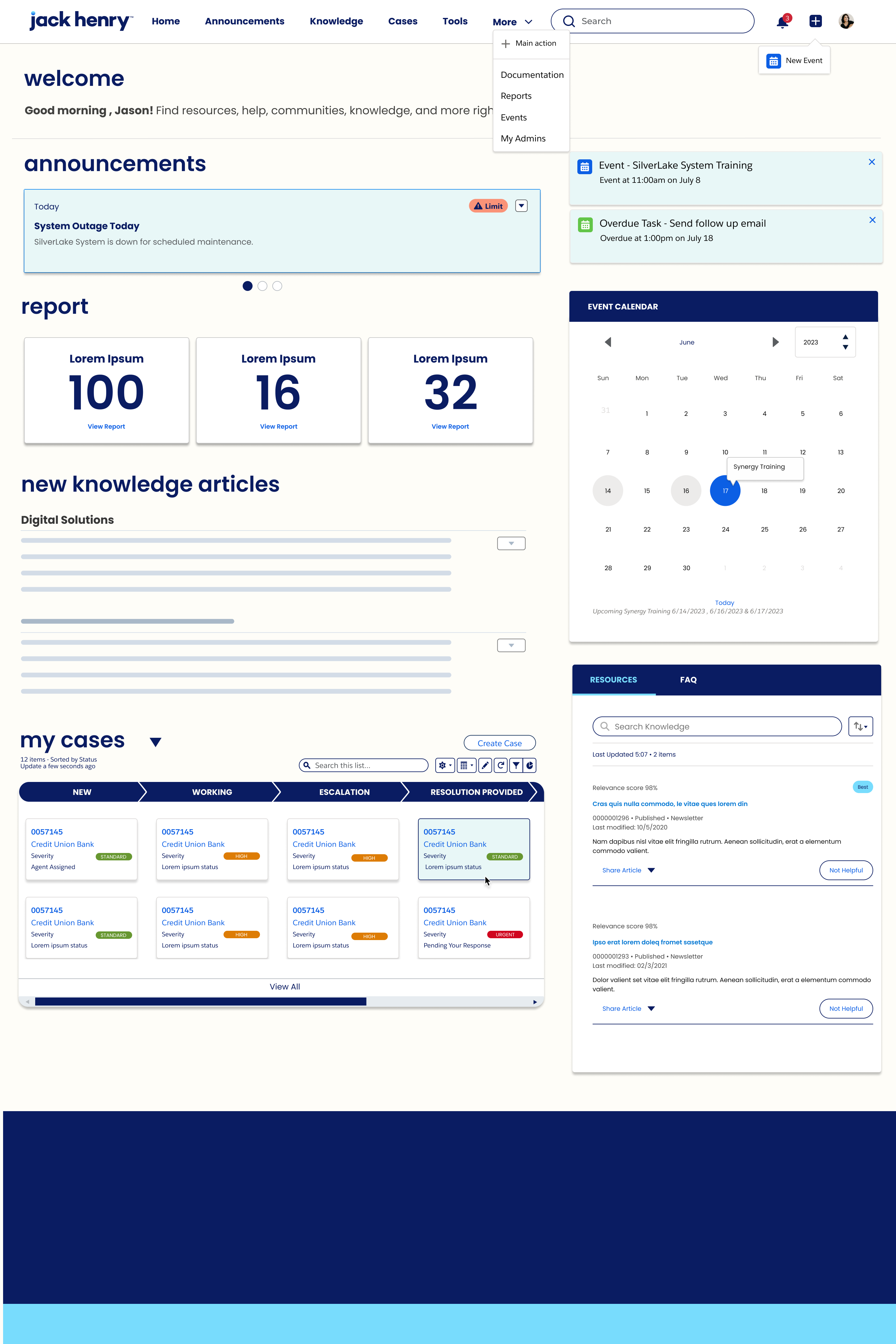
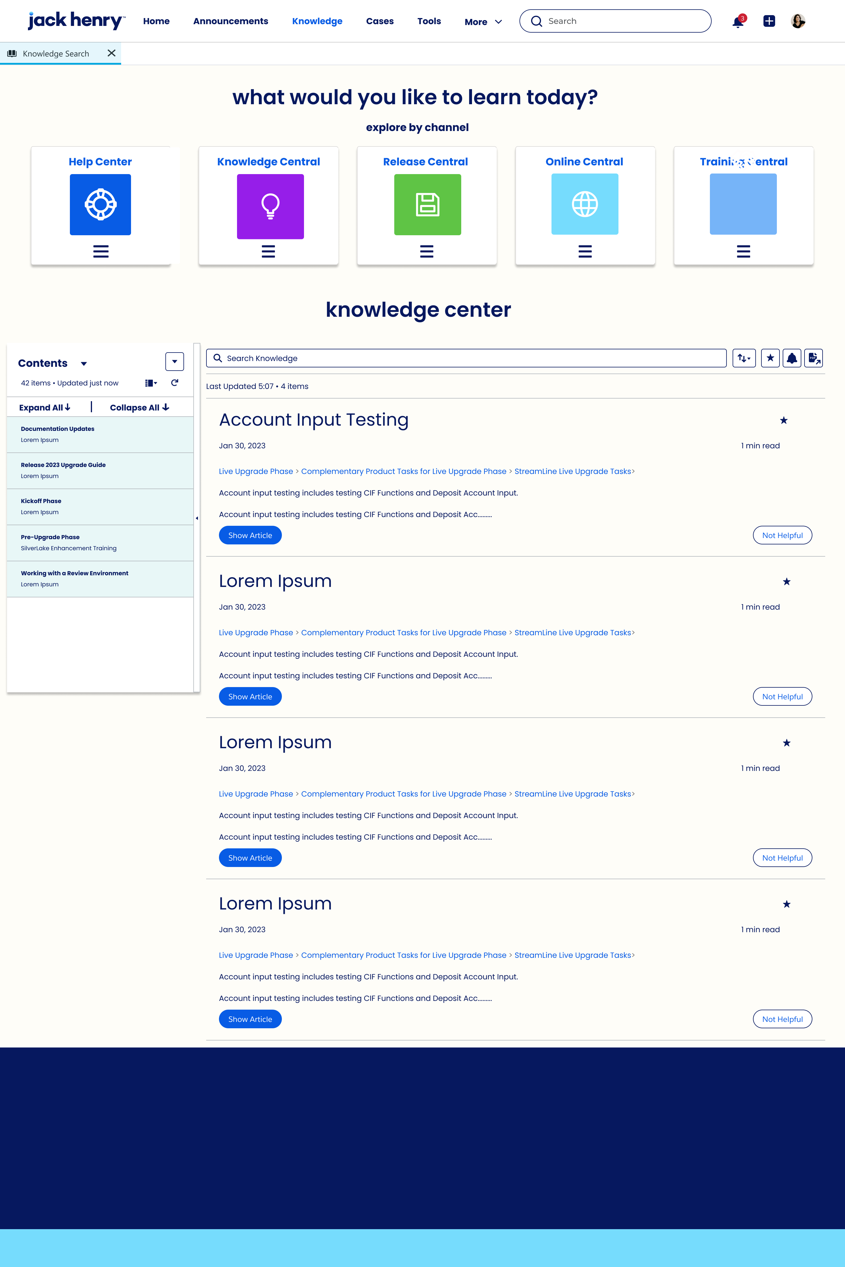
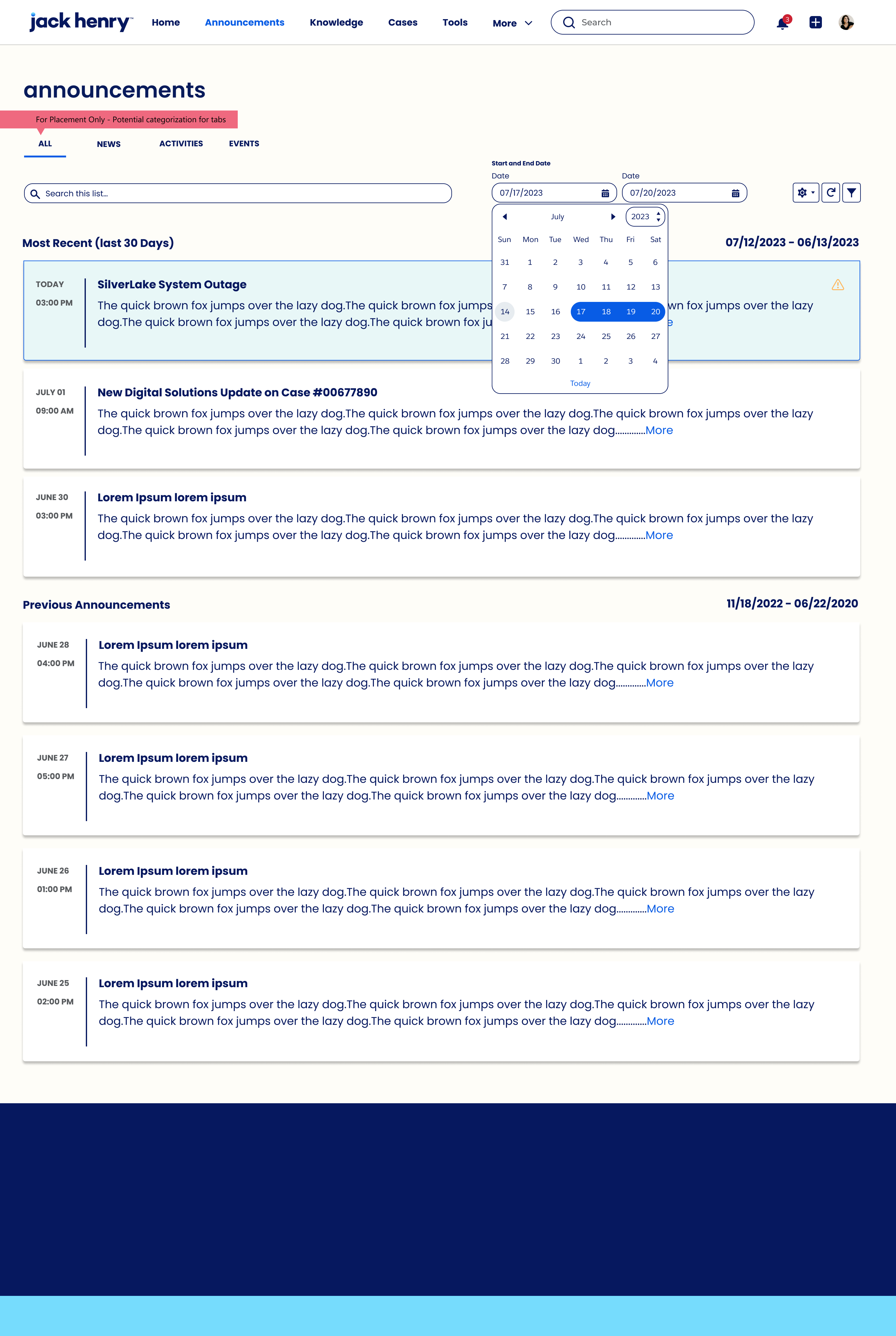
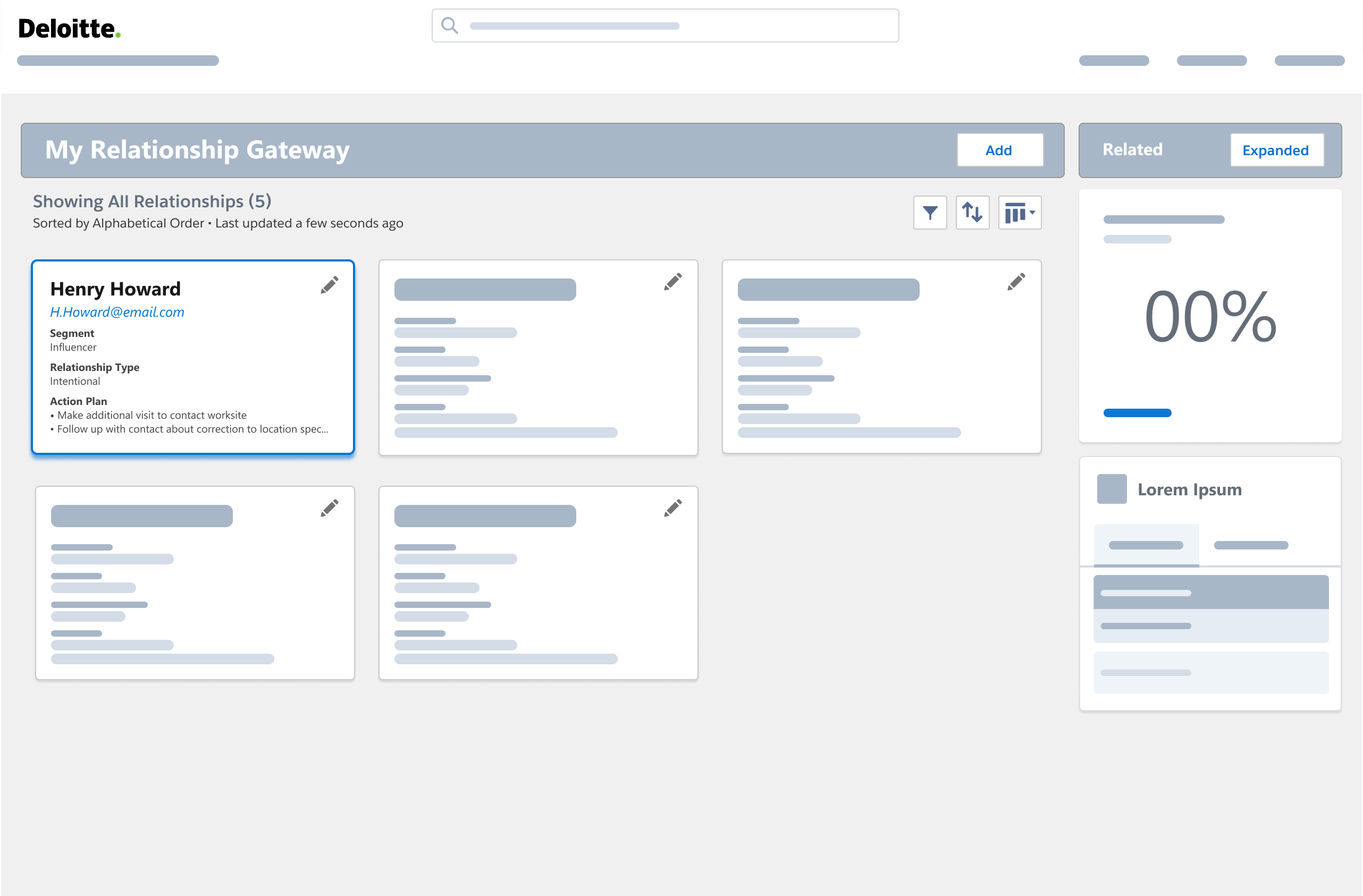
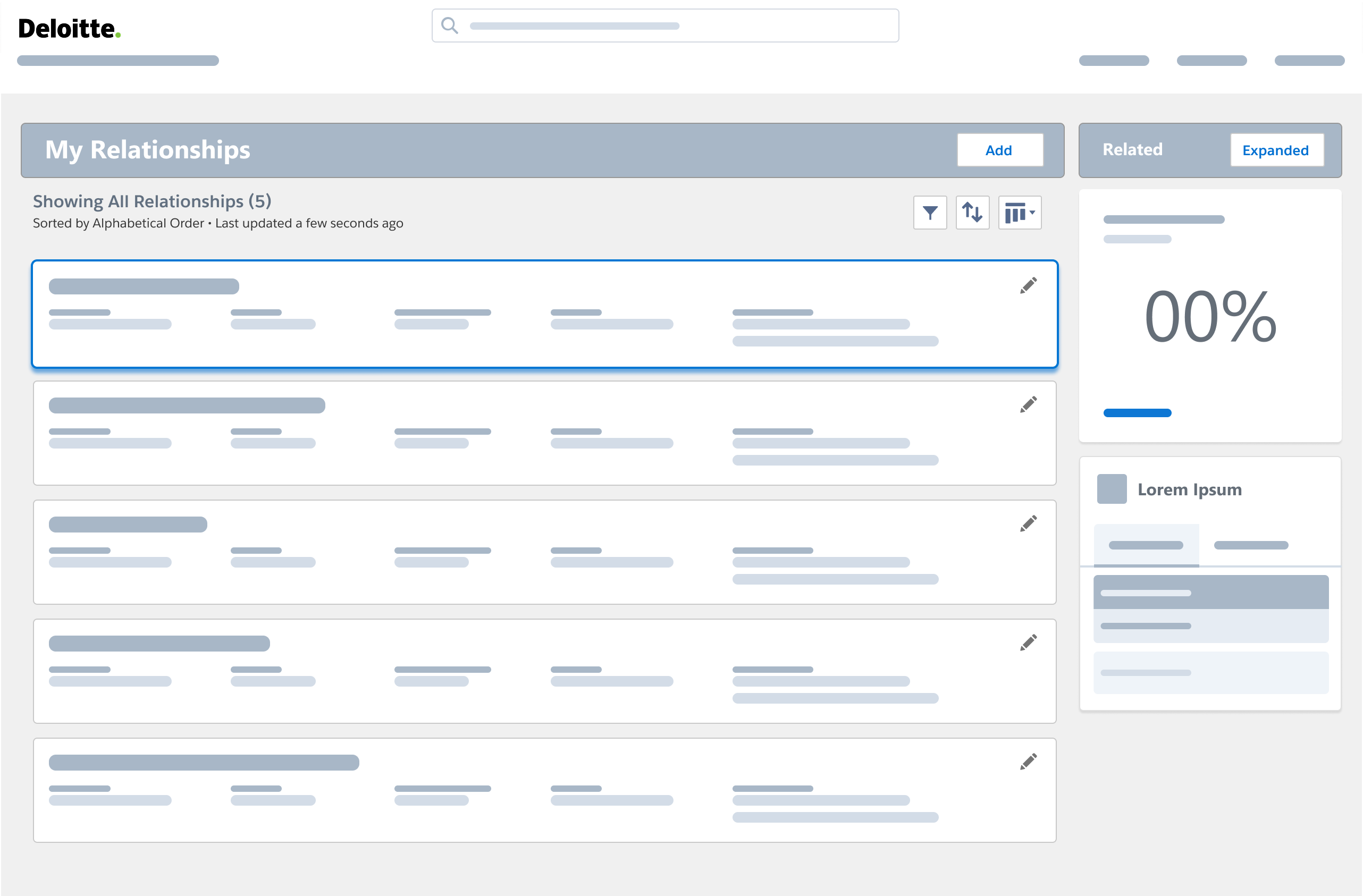
2. Gateway + home IA (SSO gate, hero, carousel)
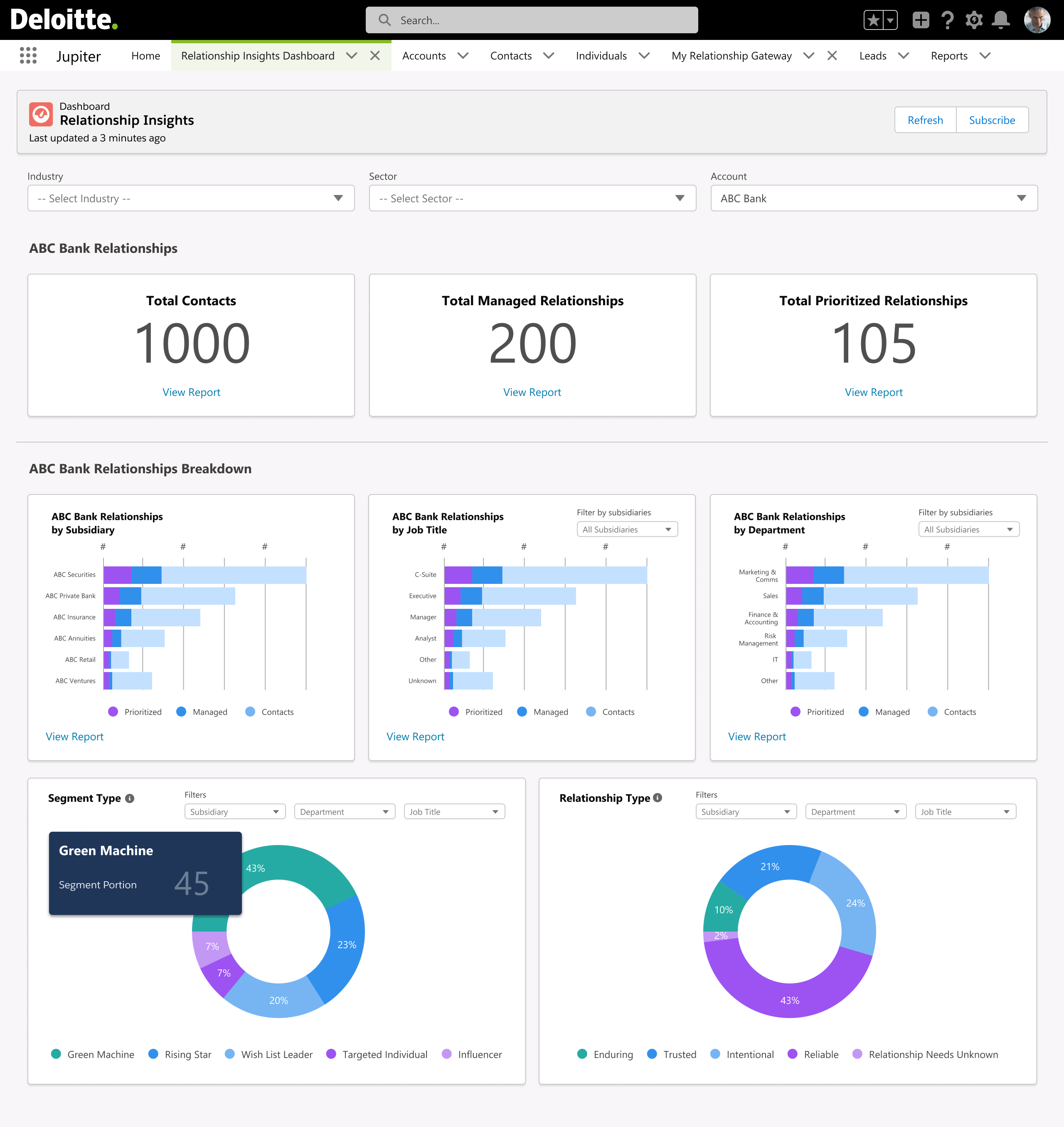
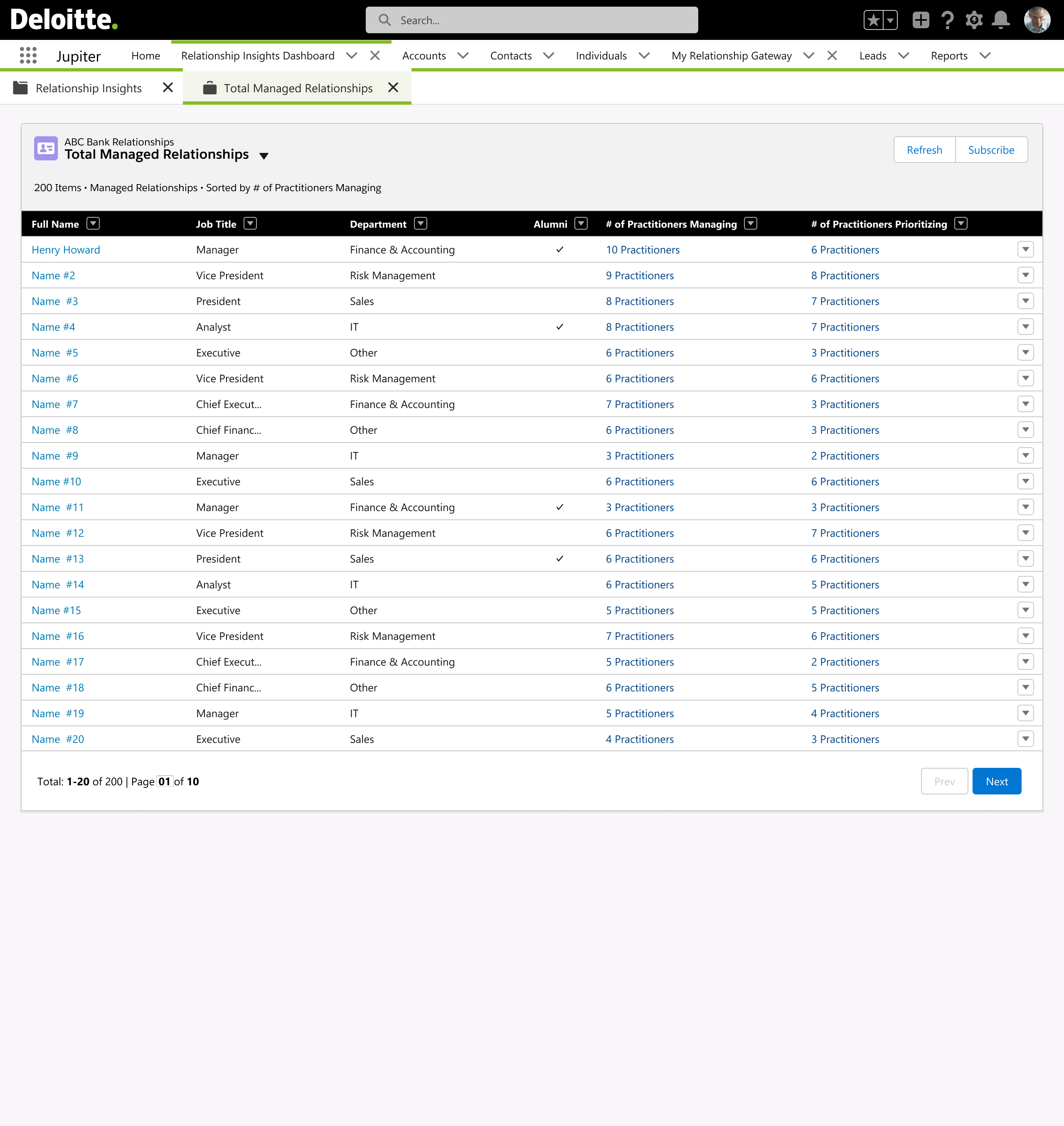
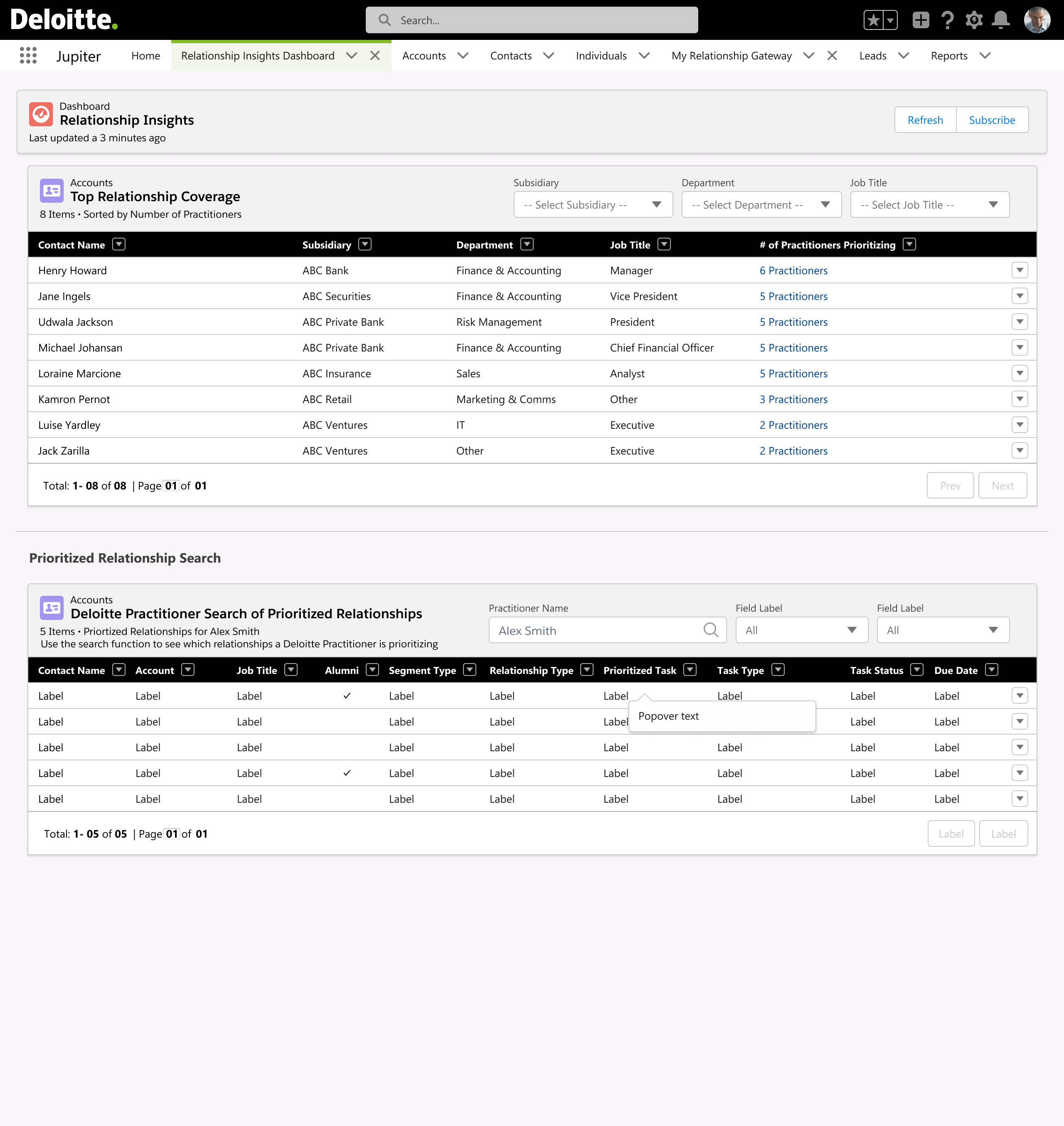
3. Relationship Insights workspace (subtabs, charts, filters)
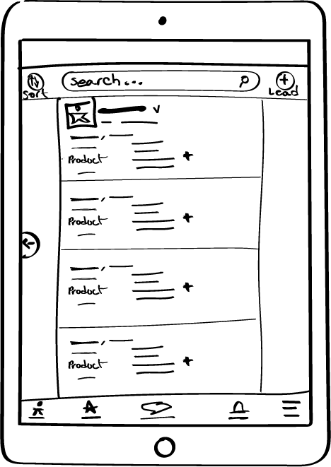
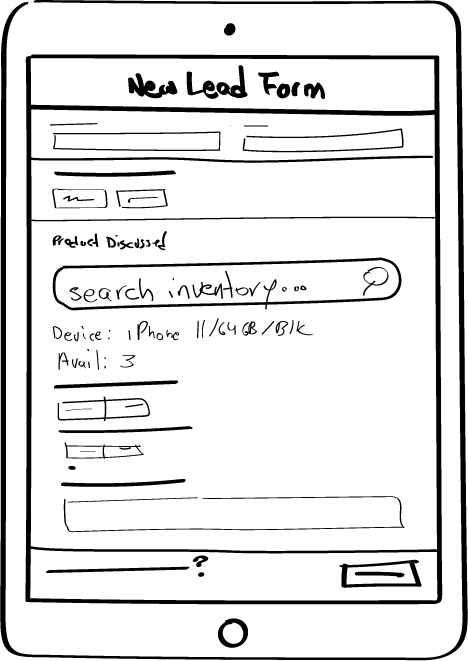
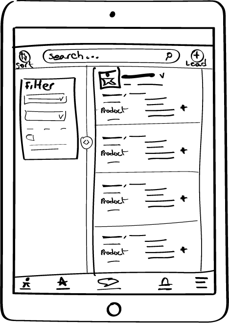
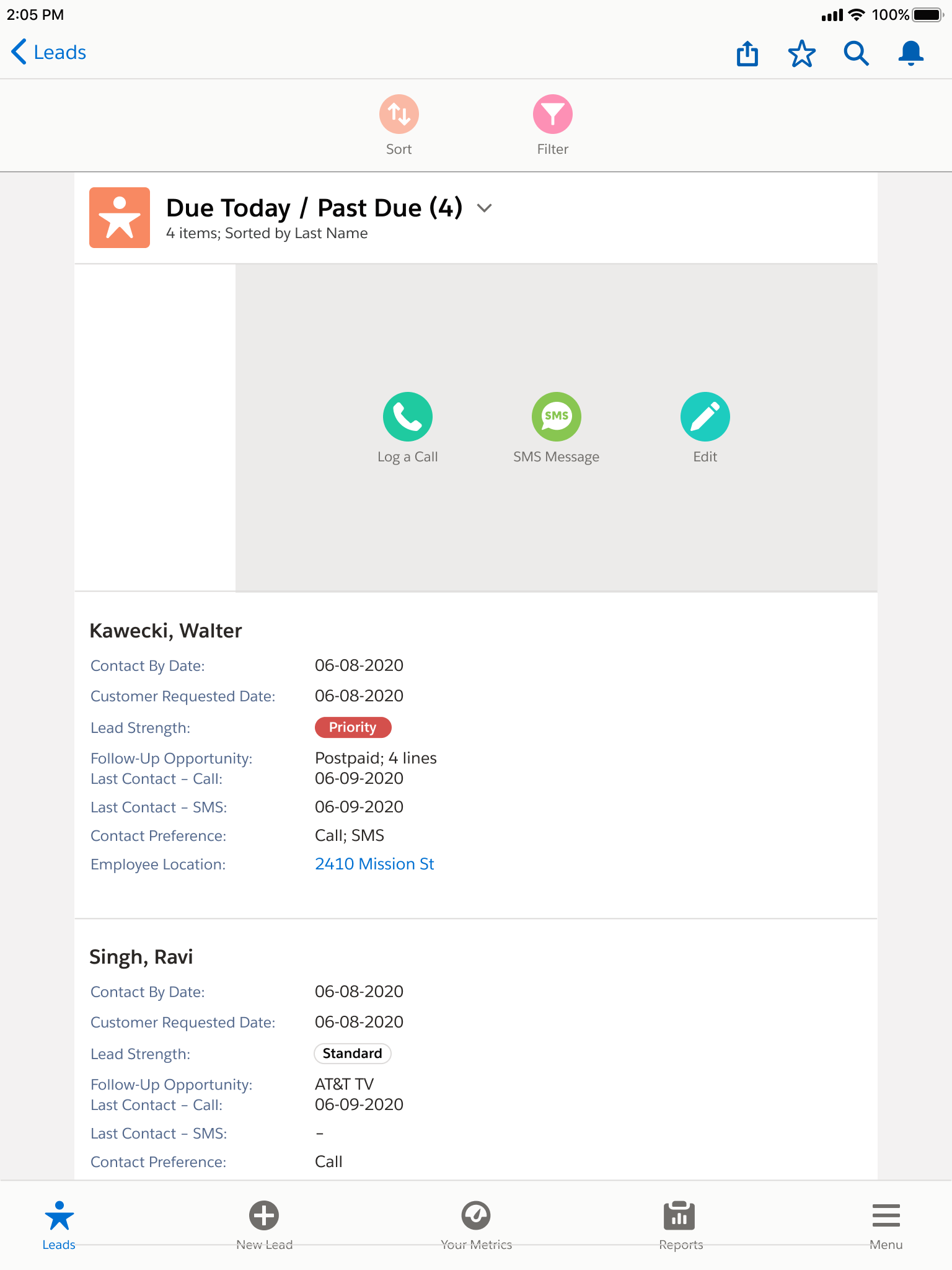
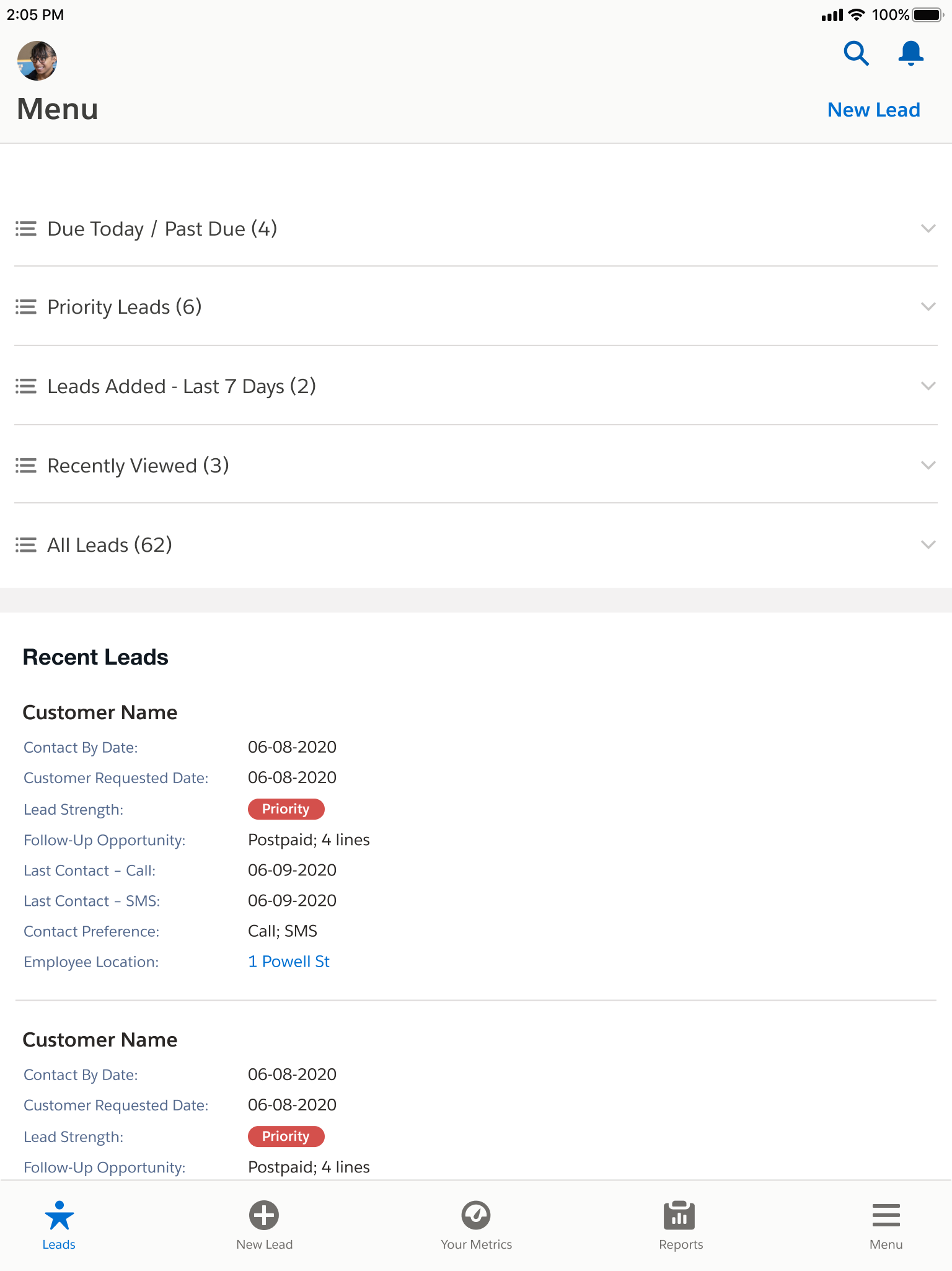
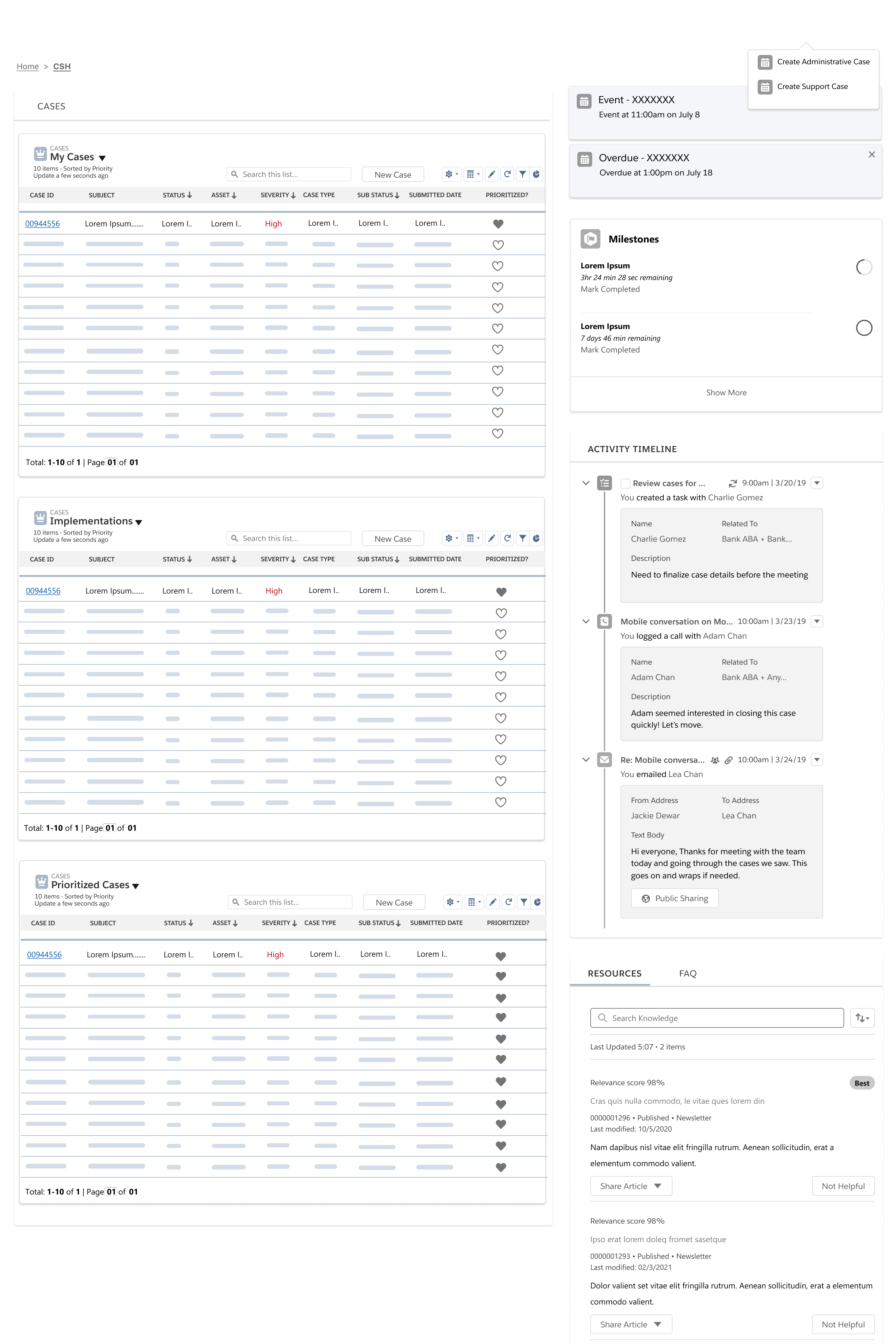
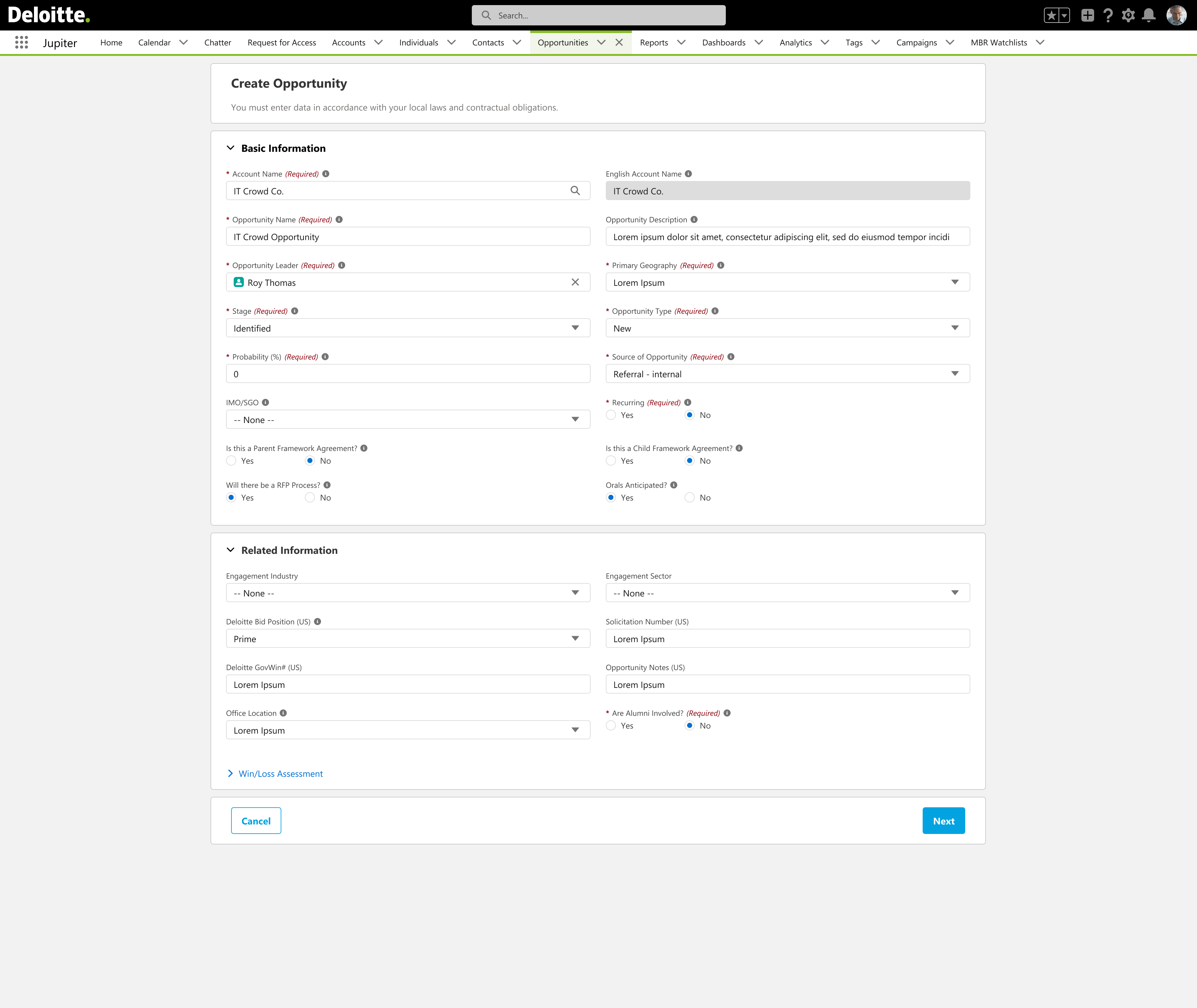
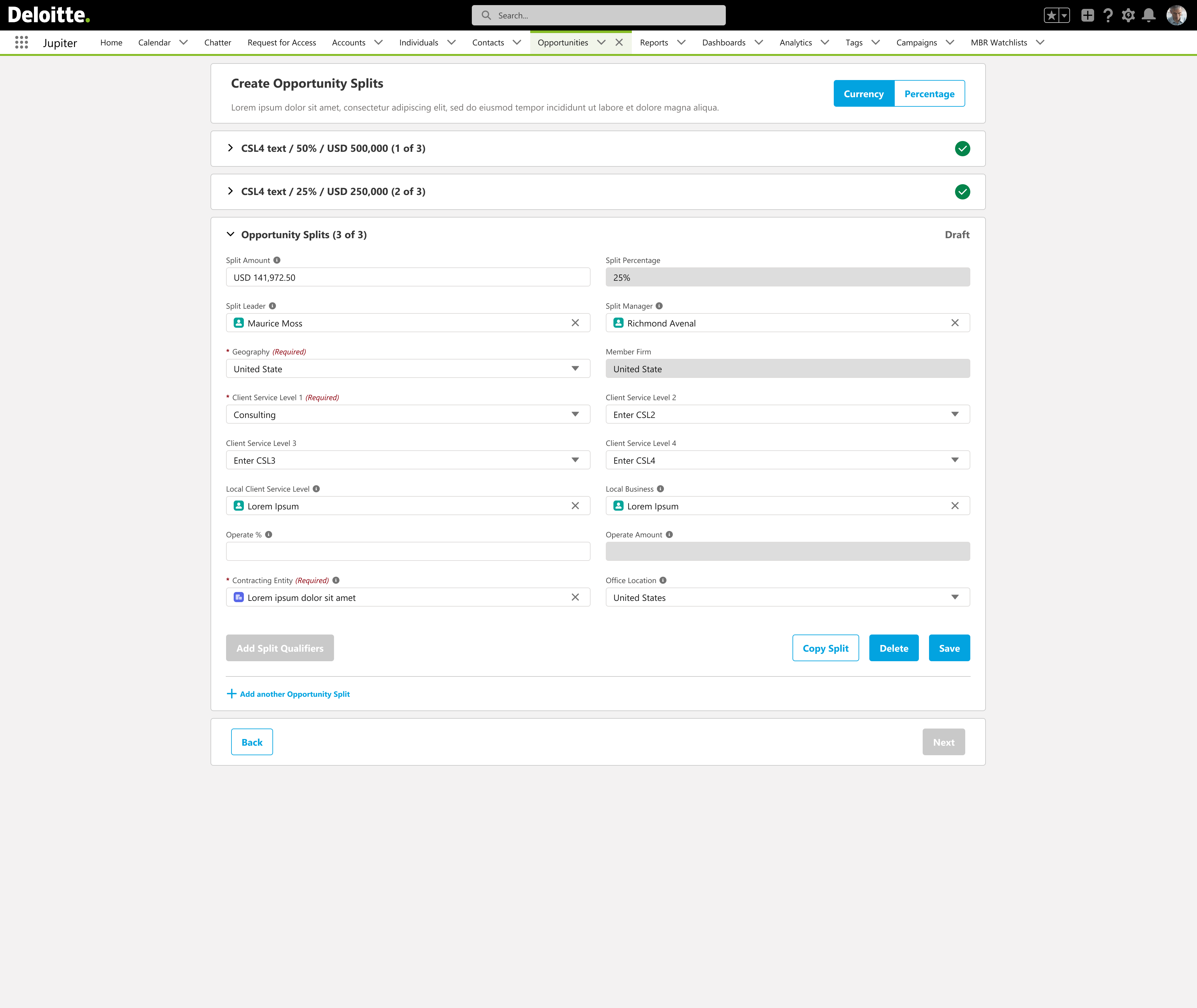
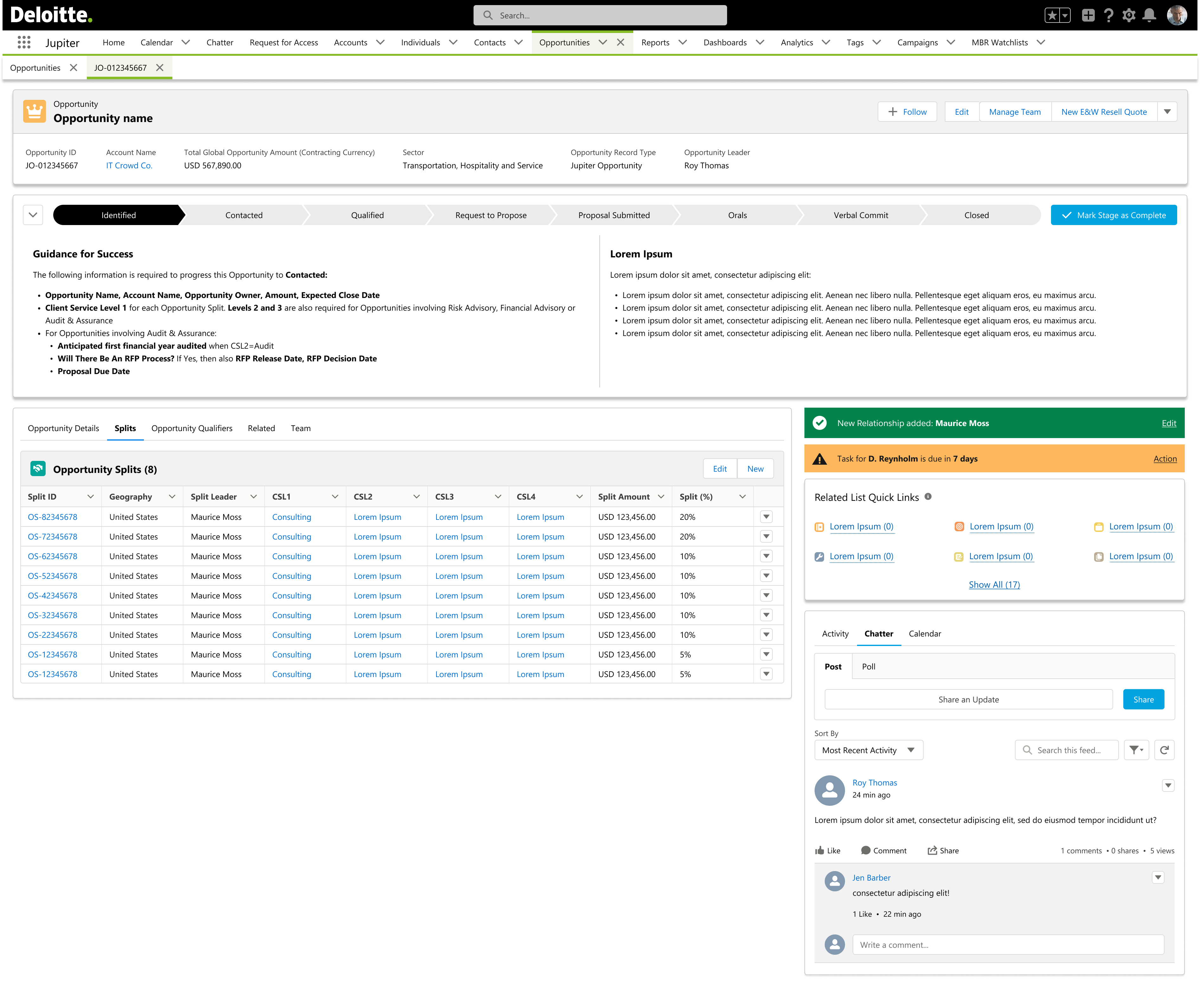
4. Opportunities + tasks lists (toolbar, pagination, row density)
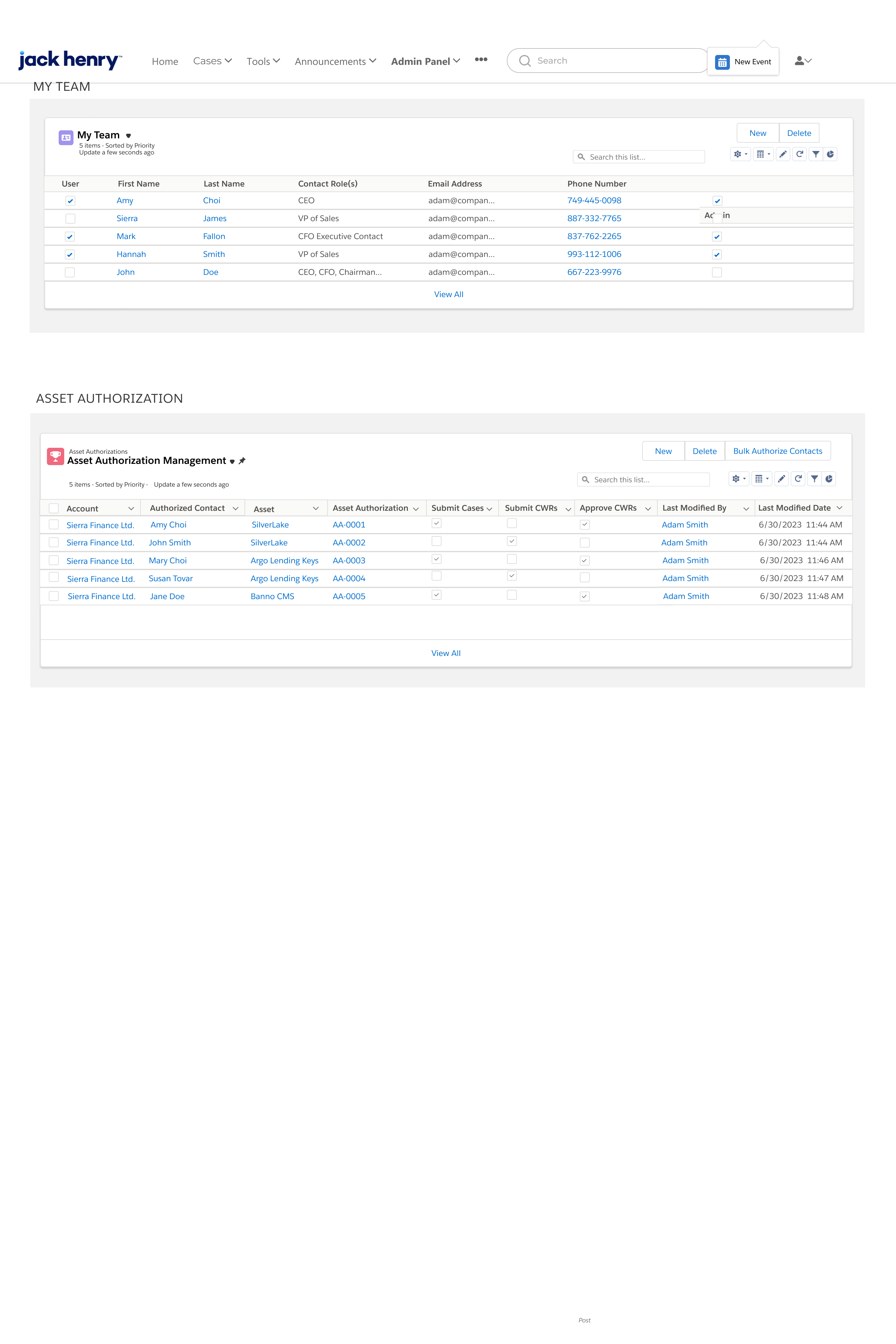
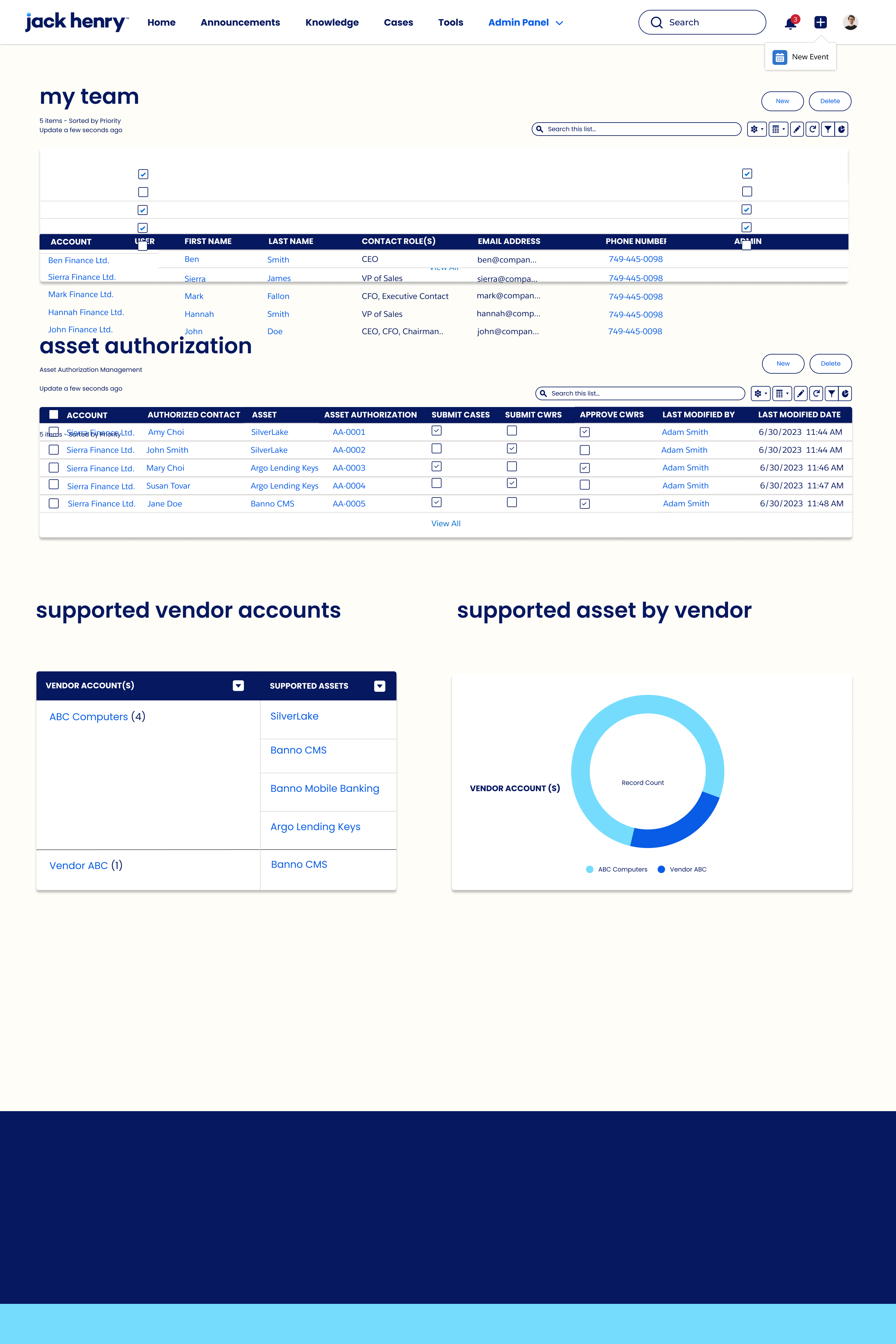
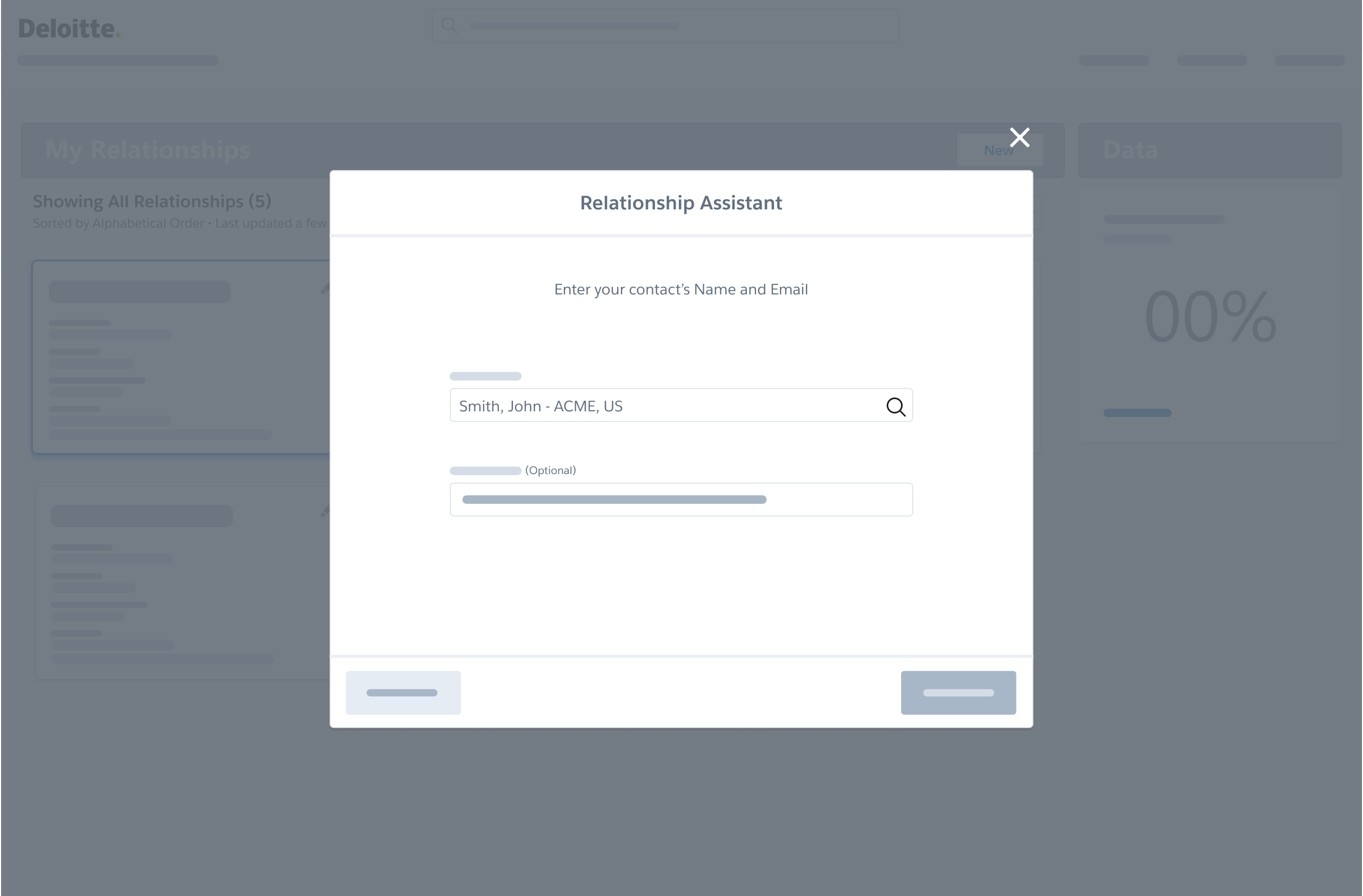
5. Admin depth, modals, and handoff-ready CSS variables

Roles

Partner Sales exec Relationship lead Operations

Execution matrix

FoundationsGateway + navInsightsPipelineSystem
Open Sans scale, 4px radius, line colorsSSO gate, global chrome, list toolbarsRI subtabs, donut + bar palettesOpportunity grid, filters, KPI rowPagination, empty states, modals
--deloitte-green / --accessible-blueHome hero + primary CTAsStacked bars + managed/prioritizedSplit views + inline editTable headers on black ink
Warn + accessible-green accentsNotifications + alertsCompliance calloutsRelationship workspaceReporting + export
UX / content System / eng Policy / admin

Screen map (labels)

00 · Gateway / SSO 01 · Home + signature hero 02 · Relationship Insights 03 · Portfolio workspace 04 · Opportunities list 05 · Task workspace 06 · Filters + saved views 07 · Record detail + tabs 08 · Charts + RI widgets 09 · Notifications 10 · Pagination + bulk actions

Each <svg> below is copied verbatim from 03_deloitte-partner-portal.html (same markup as the live prototype). <code> labels name the nearest stable selector in that file (class or control id). Omitted here: Deloitte wordmarks, runtime chart shells (ri-donut-svg), and sub-pixel fragments. Preview uses monochrome #111827; prototype greens map to that for the grid. Cross-check strokes and spacing against your local Deloitte References/ PDFs (Color Scheme, Web Style Guide, Mobile App Guidelines).

#login-gate
.icon.icon-stroke
.icon.icon-stroke
.icon.icon-stroke
.icon.icon-stroke
.icon.icon-stroke
.icon.icon-stroke
.icon.icon-stroke
.slds-icon.slds-icon--small
.slds-icon.slds-icon--x-small
.slds-icon.slds-icon--xx-small.appnav-chev
.slds-icon.slds-icon--xx-small
.icon-stroke
.icon-stroke
.icon-stroke
.icon.icon-stroke
.icon.icon-stroke
.slds-icon.slds-icon--x-small
.list-toolbar-ico--cov
.ico-tb
.slds-icon
.ico-tb
.ico-tb
.list-toolbar-ico--prac
.list-toolbar-ico--abc
.list-toolbar-ico--man
.ico-tb
.ico-tb
.ico-tb
.list-toolbar-ico--mod
.list-toolbar-ico--gw
.list-toolbar-ico--fp
.gw-rail-alert-ico
.gw-rail-head-ico--link
.gw-act-ico--call
.gw-act-ico--web
.gw-act-ico--mail
.gw-act-ico--person
.list-toolbar-ico--opp
.ico-tb
.opp-record-icon
.icon.icon-stroke
.icon.icon-stroke.chev
.split-acc-check
.split-lookup-ico
.split-lookup-ico
.list-toolbar-ico--rel
#rel-btn-log
.icon.icon-stroke
.icon.icon-stroke
.icon.icon-stroke
TF_SUMMARY_FUNNEL_SVG

Deloitte, Partner Experience

Partner
Portal

An interactive prototype of a Deloitte workspace where partners start their journey, onboard, surface relationship insights, manage opportunities, configure accounts, and other gateway signals. This prototype is a part of the initial MVP. Click below or around the prototype screen.

6,905+
Partners
10+
Systems unified

Deloitte, Partner Experience

Impact &
Outcomes

Outcomes tied to the Partner Portal MVP: broader partner coverage in one workspace, fewer tool hops between CRM and legacy systems, and faster prep for pipeline and relationship reviews.

Projected savings

FY2023 • FY2024

$72Mprogram curve at FY2024 Q2 (illustrative)

Without Partner Portal alignment With IA, design system, and experience-led delivery

Illustrative curve: baseline reflects incremental UI tweaks; program line assumes IA lock, Experience Cloud patterns, and pilot hardening across partner teams.

Partner adoption depth

6,905+

partners in governed workspace

Adoption depth (indexed)

One Experience Cloud hub replaced scattered email and spreadsheets for partner health and opportunities at scale.

Adoption rates

+25%

portal usage up after a long flat plateau

Portal usage (indexed)

One governed portal became default; usage rose when cases, knowledge, and tools shared one navigation model.

Partner program signup completion

+55%

completion rates and submissions on gated flows

Signup completion (indexed)

Aligned steps, progress saves, and IA-consistent validation reduced drop-off on partner enrollments versus fragmented email handoffs.

How I Work

Approach

01 / Discover

Grounded, Collaborative Research

I run workshops, interviews, and live tool walkthroughs with retail, financial operations, and partner sales teams so pain points are clear before design begins.

02 / Define

Clear IA, Journeys, and Decisions

I map information architecture and user flows with product and engineering so tradeoffs stay visible, shaping navigation and the impact stories tied to each prototype.

03 / Design

Hypothesis to Reality

I translate design system tokens and components into high fidelity Salesforce, Jack Henry, and Deloitte prototypes so teams validate real flows instead of static decks.

04 / Deliver

Expectations and Outcomes

I deliver specs, behavior notes, and engineering checkpoints through build, with impact views that use before and after markers and projections while production metrics are still catching up.

Salesforce, IBM, and Accenture